Reviving the retro – Evaluating GenAI Image tools
Reviving the retro – Evaluating GenAI Image tools

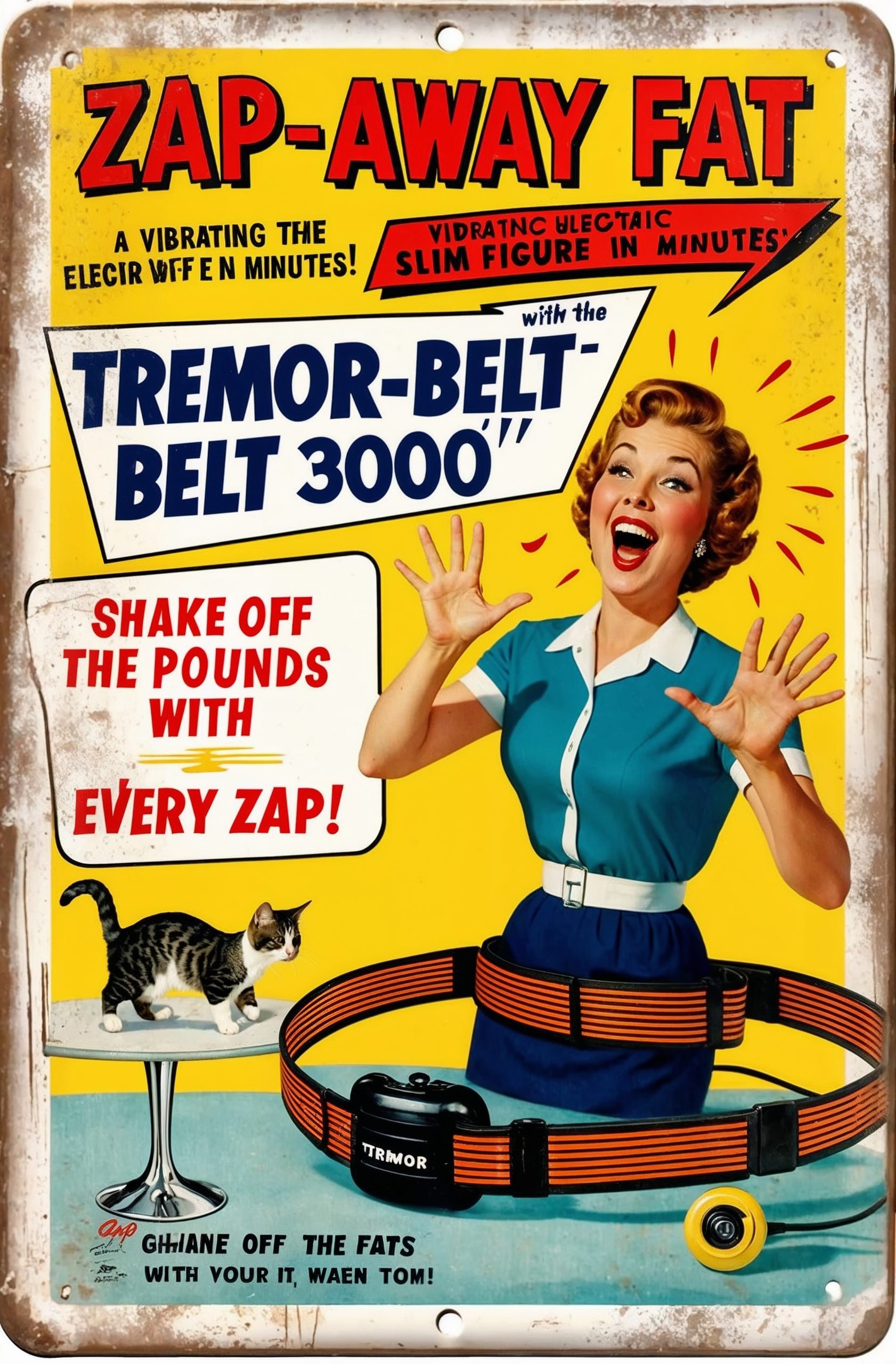
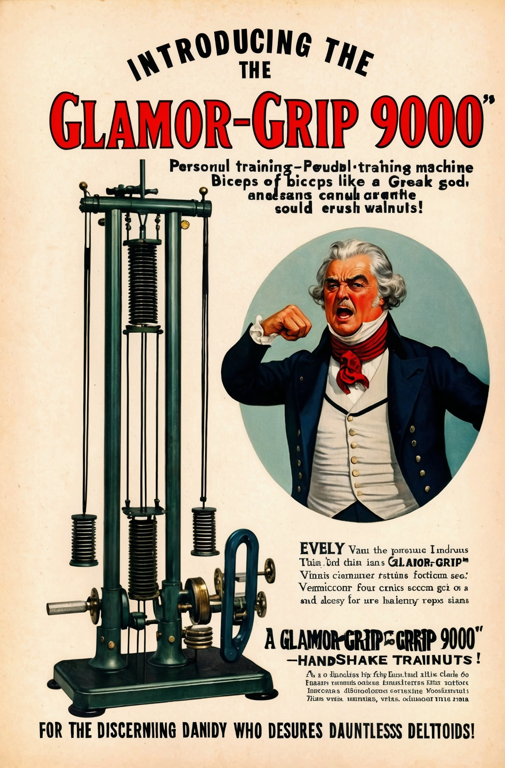
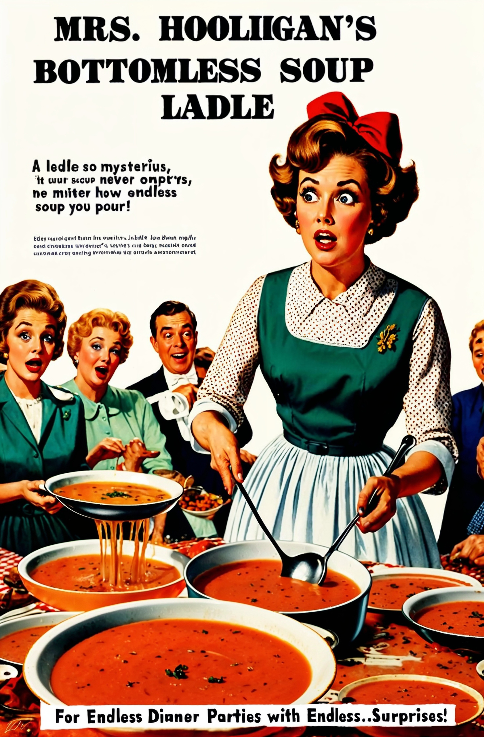
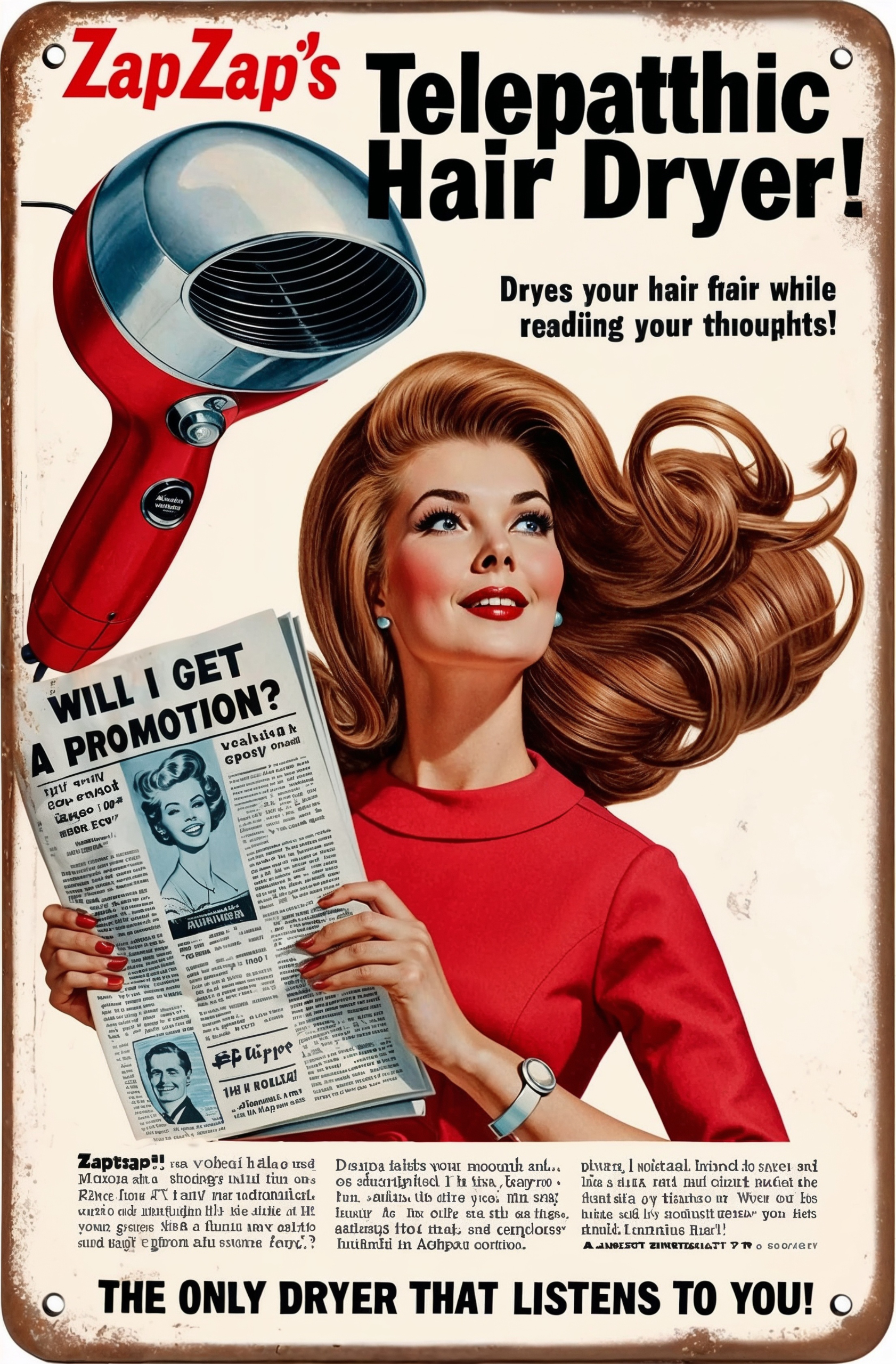
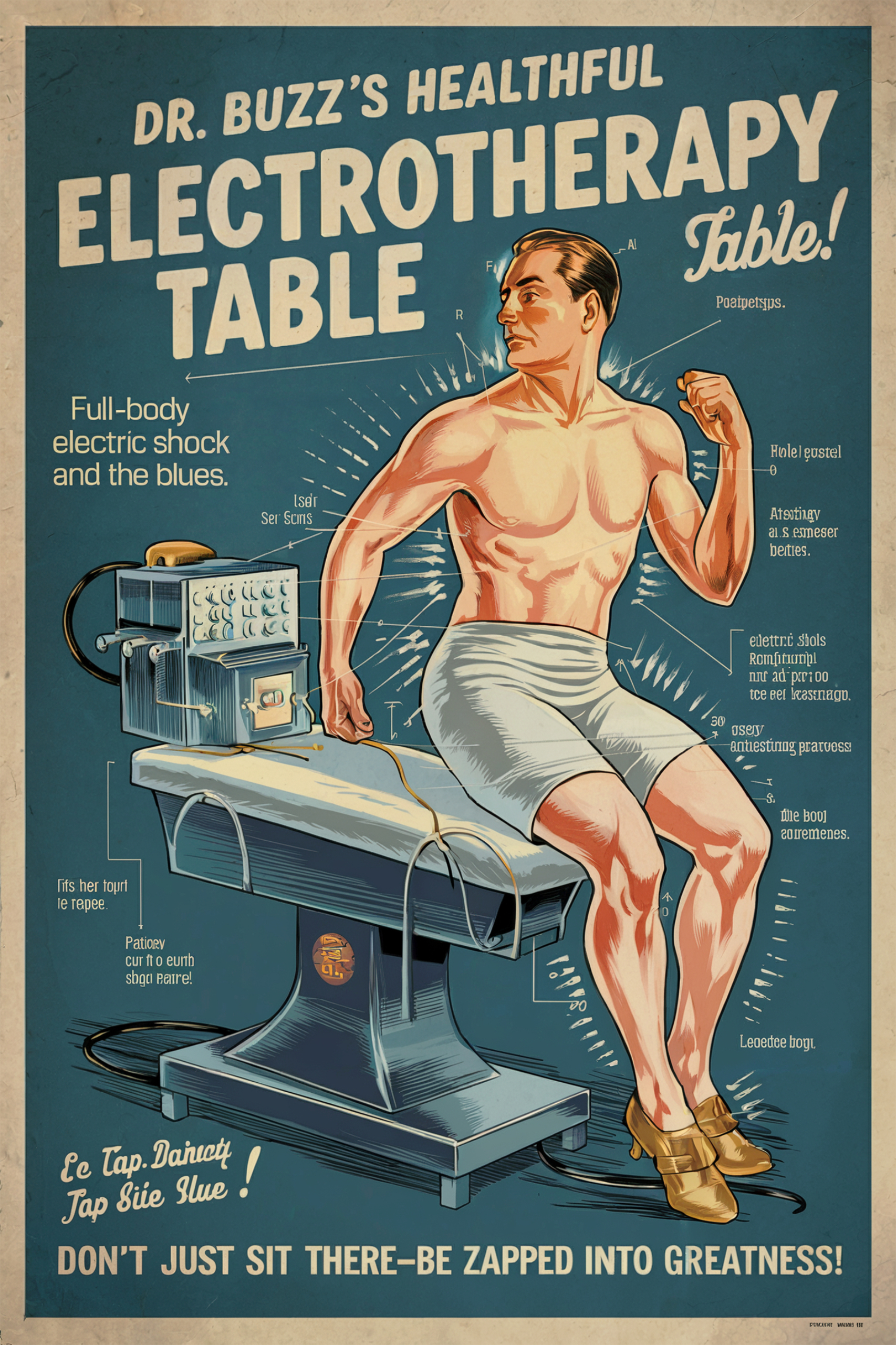
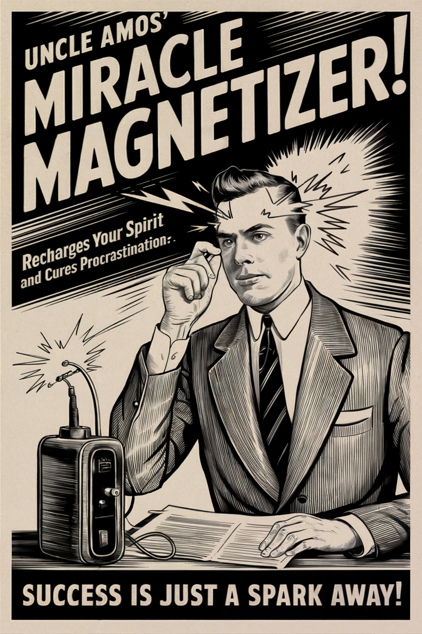
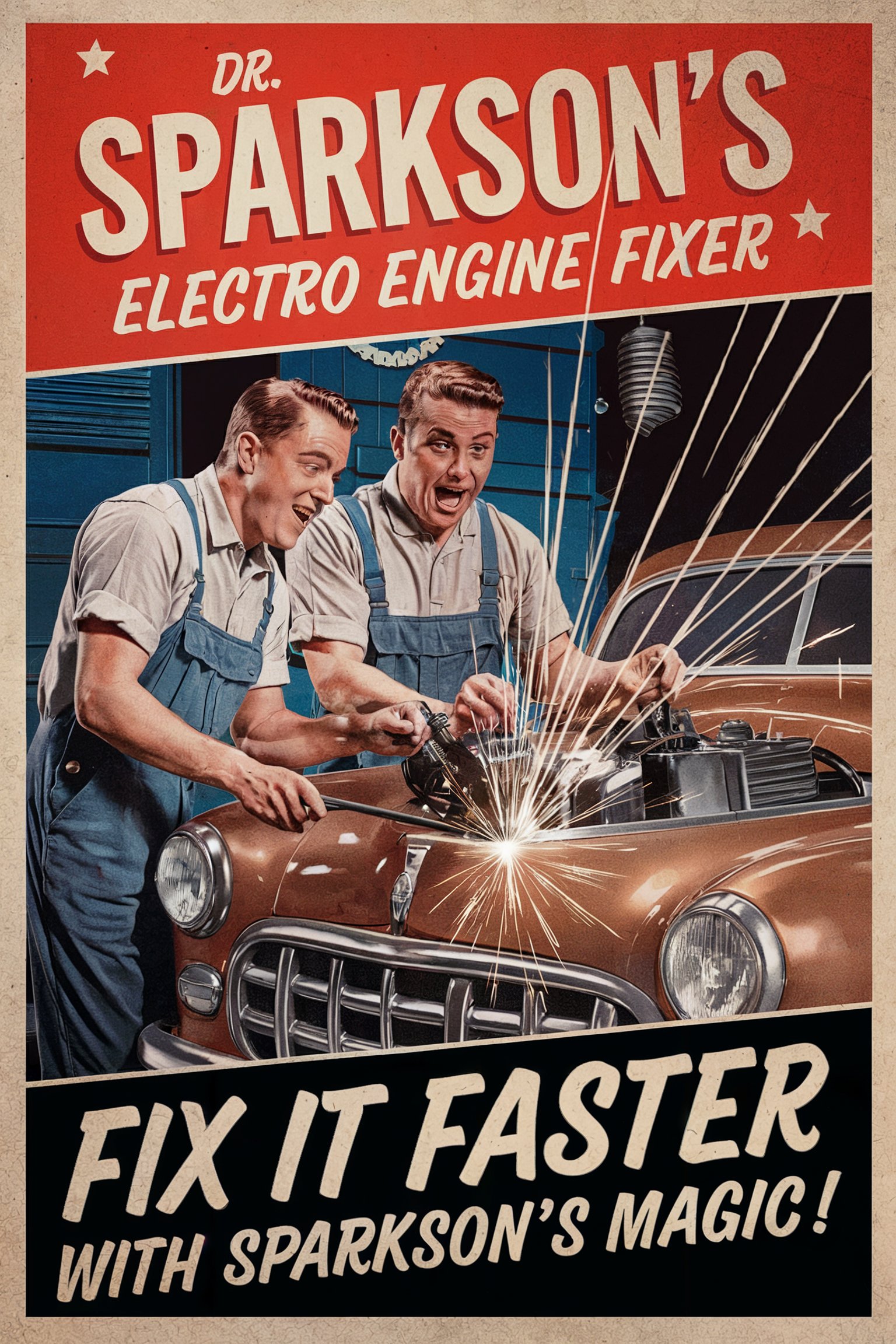
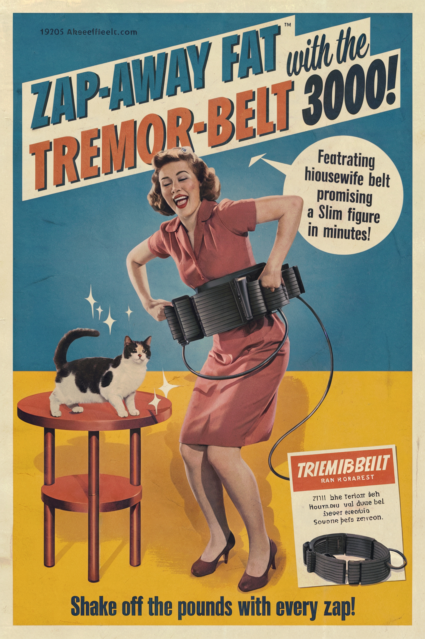
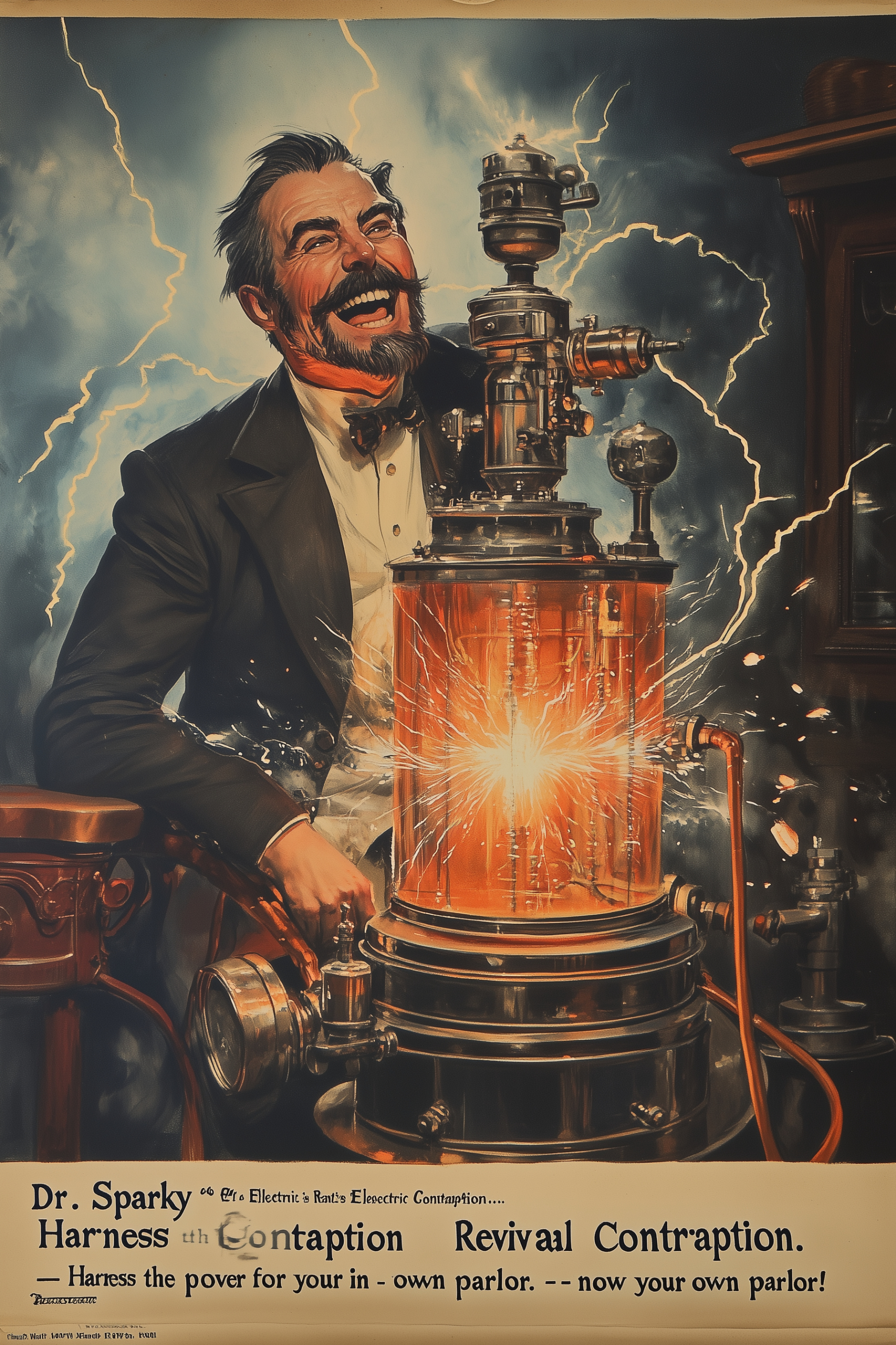
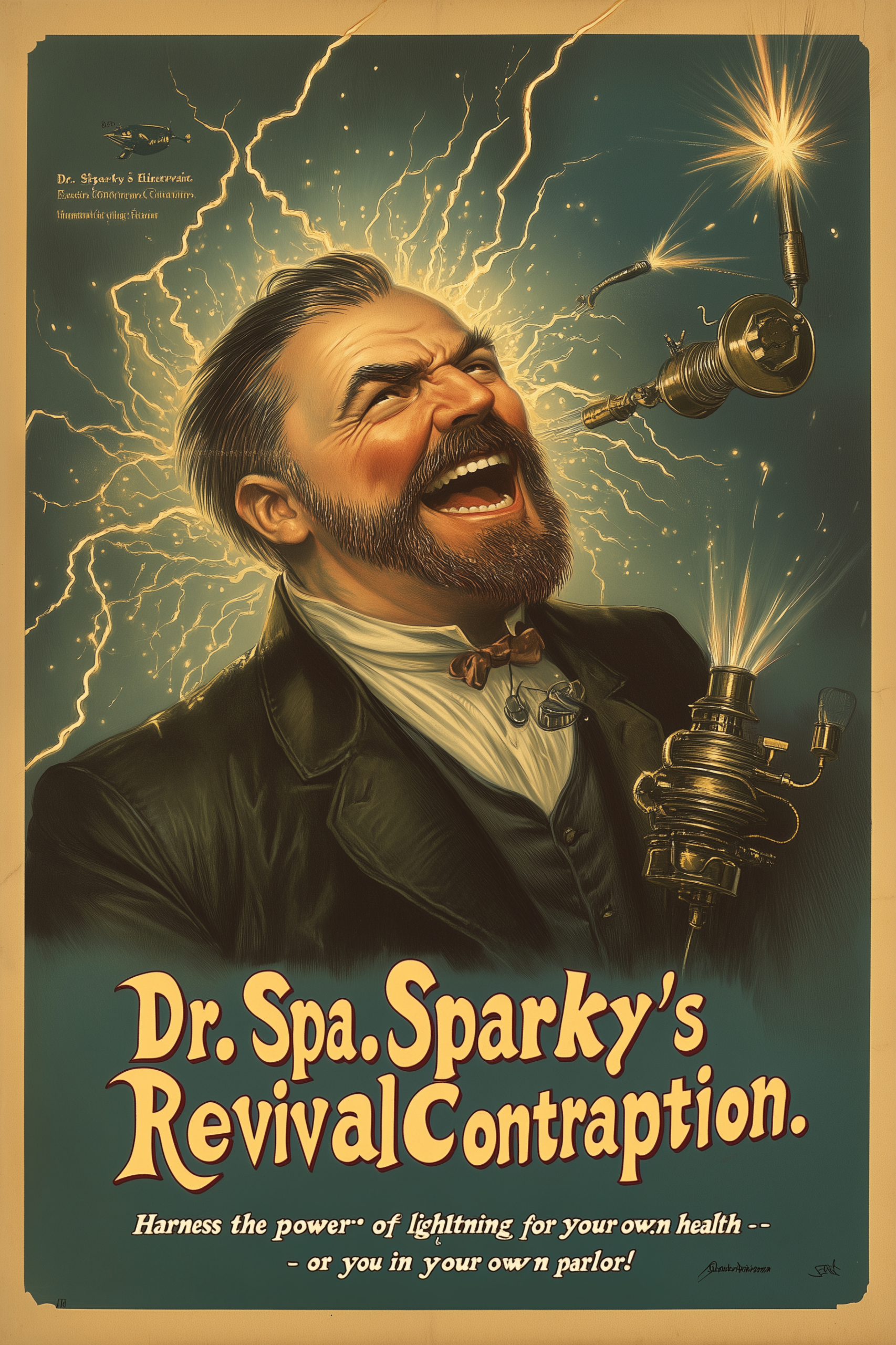
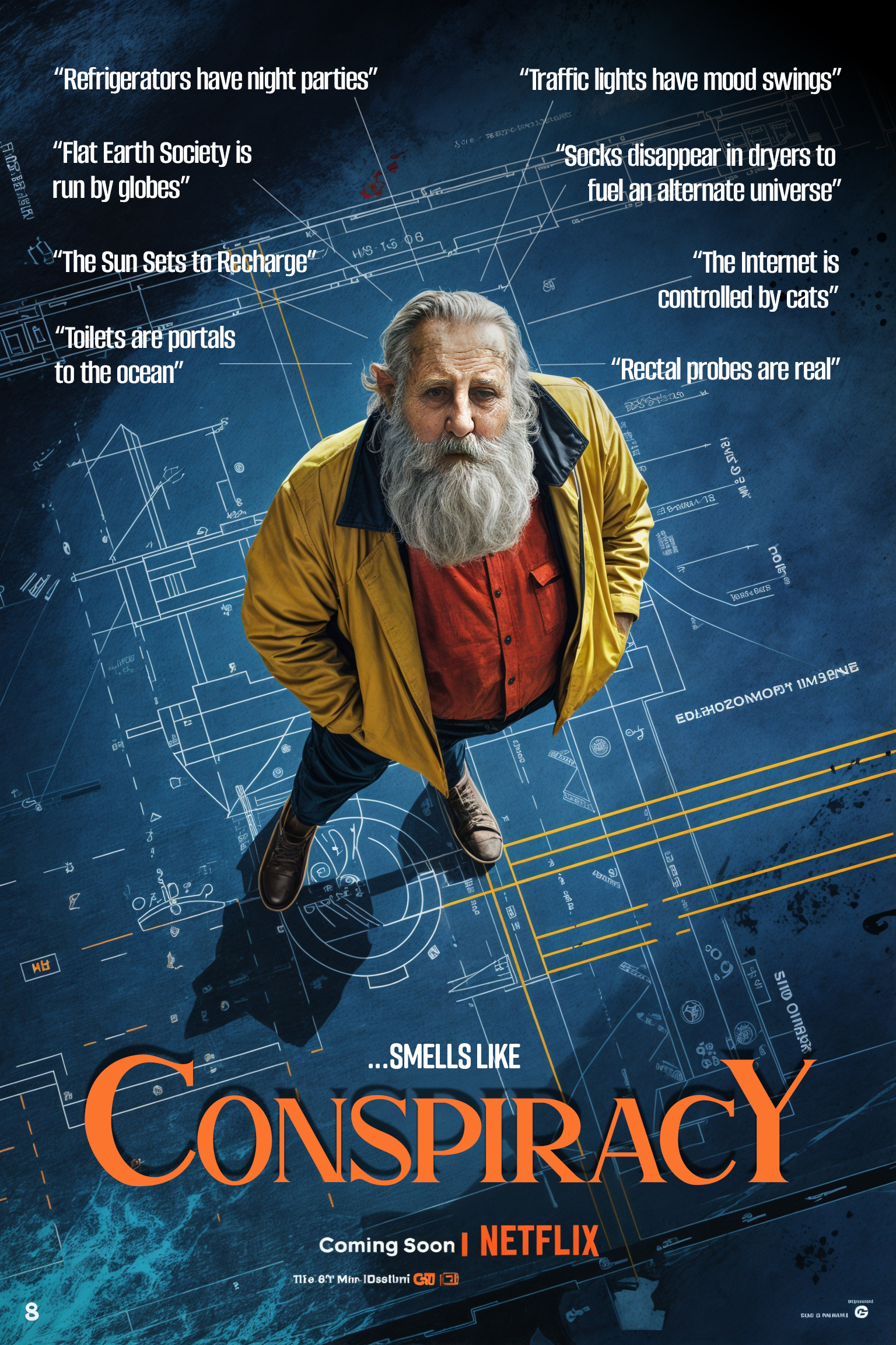
Generative AI has revolutionized visual creativity, but how well do these tools stack up when tasked with creating authentic vintage/retro advertisements? Using a consistent style theme, I tested five popular AI tools — MidJourney, Krea, Ideogram, Freepik, and Leonardo AI — to see which delivers the best results. From iconic Victorian lithographs to 50s retro-futurism, this post explores their strengths, weaknesses, and whether AI can truly capture the essence of a bygone era.
Setting the Stage
The charm of vintage/retro advertisements lies in their intricate details, nostalgic appeal, and artistic diversity spanning decades. From Victorian lithographs and roaring 20s trade cards to mid-century catalogs and 50s retro-futurism, the style demands not only artistic flair but technical precision. To evaluate how well GenAI tools perform, I tested five leading platforms, applying the same prompts and measuring their output against 18 key criteria.
The Challenge
Can GenAI image tools create compelling visuals that feel authentic to their respective eras? And beyond aesthetics, how do they handle prompt accuracy, customization, style consistency, user experience, text and typographic? Here’s what I discovered.
Disclaimer
This comparison does not take into account how well different style themes correspond to the selected tools or the specific model versions used during the evaluation. The text prompts in this study were specifically crafted to evaluate how well each tool handles graphic design, text rendering, context accuracy, and adherence to the selected time period and style (vintage/retro ads).
It is also worth noting that, at the time this study was conducted, tools such as MidJourney were on the verge of a major update to version 7, which could significantly impact future outcomes. The results presented here are context-specific and focused on the particular requirements of this case. The outcome of this evaluation would undoubtedly differ if the focus were shifted to other creative styles, such as illustrations, paintings, photography, or other media. As such, the scores provided here are not universally applicable and may vary depending on the intended use case or style.
Leonardo AI
Used Model: Leonardo Phoenix
For me, this tool is a bit of a revisit. I first tried Leonardo AI back in early 2023 alongside other GenAI image tools that were emerging at the time. Back then, I felt the results had a somewhat generic tone, seemingly optimized for broader audience appeal. Last week, I decided it was time to give Leonardo AI another try. A lot has happened since I last used it, and I’m glad I did. Previously, I found the user interface to be more complicated and cluttered. Now, everything has changed—Leonardo has a much cleaner, straightforward, and intuitive UI. Gone are the overwhelming options, replaced with a sleek interface that integrates seamlessly with a growing suite of tools designed for workflow-related tasks.
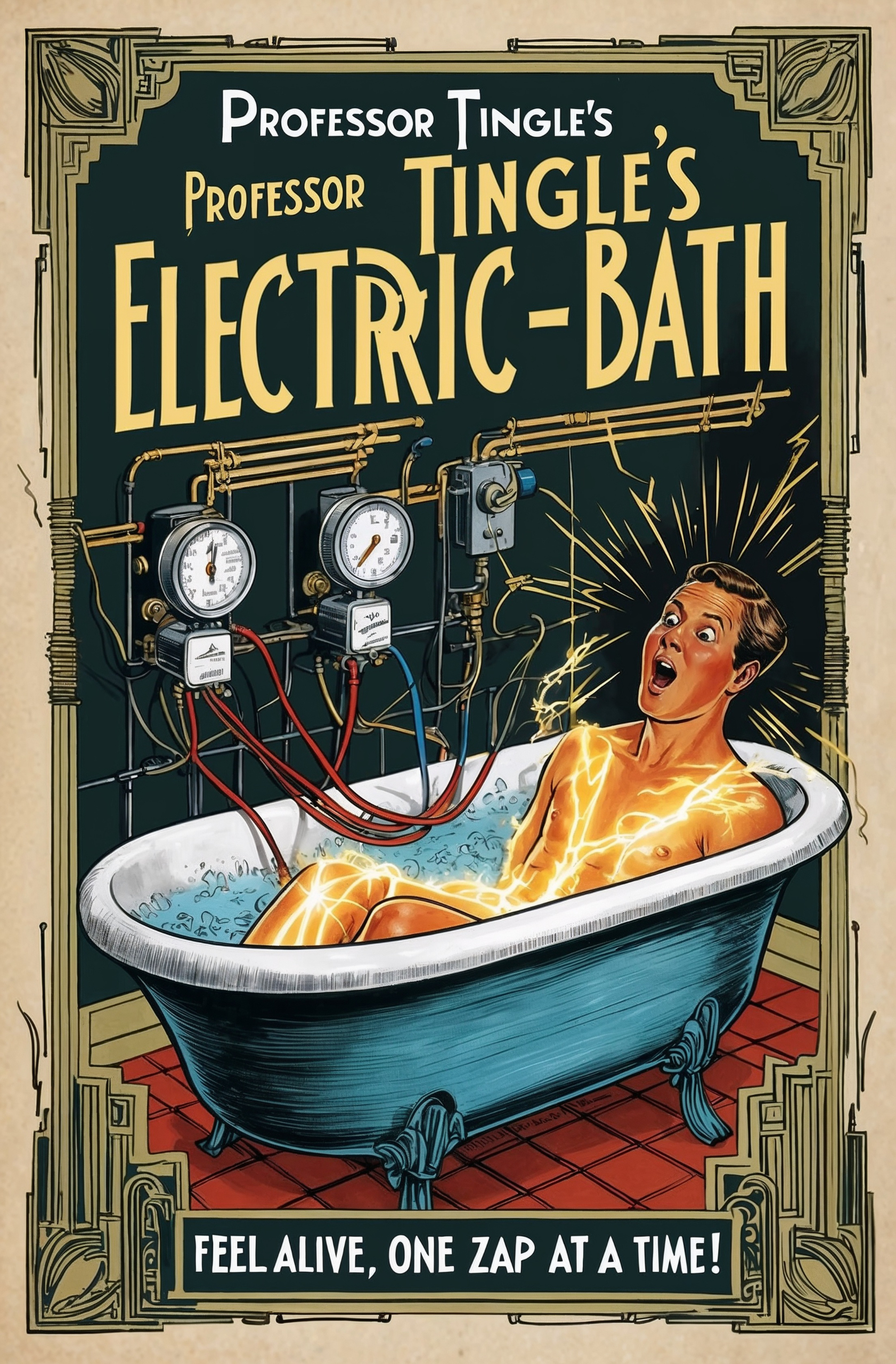
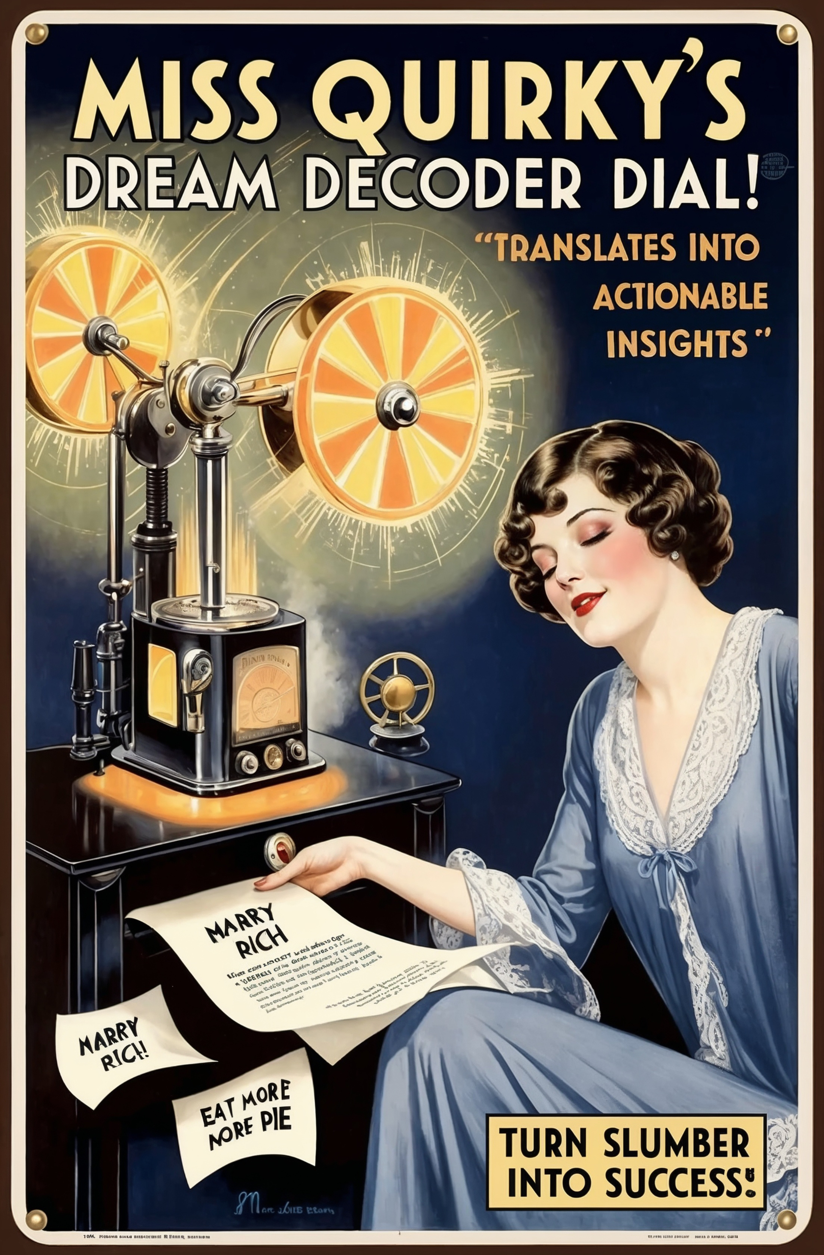
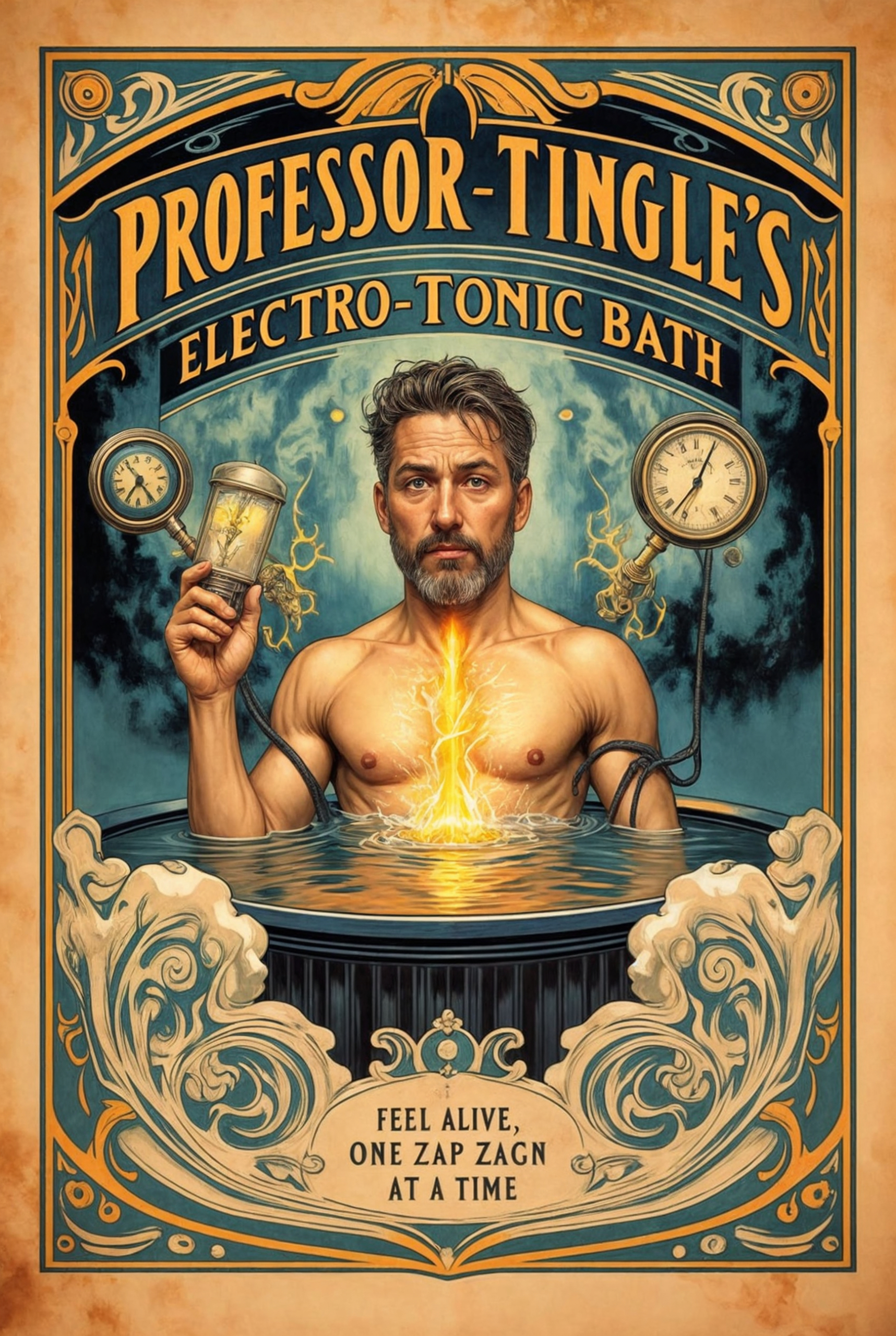
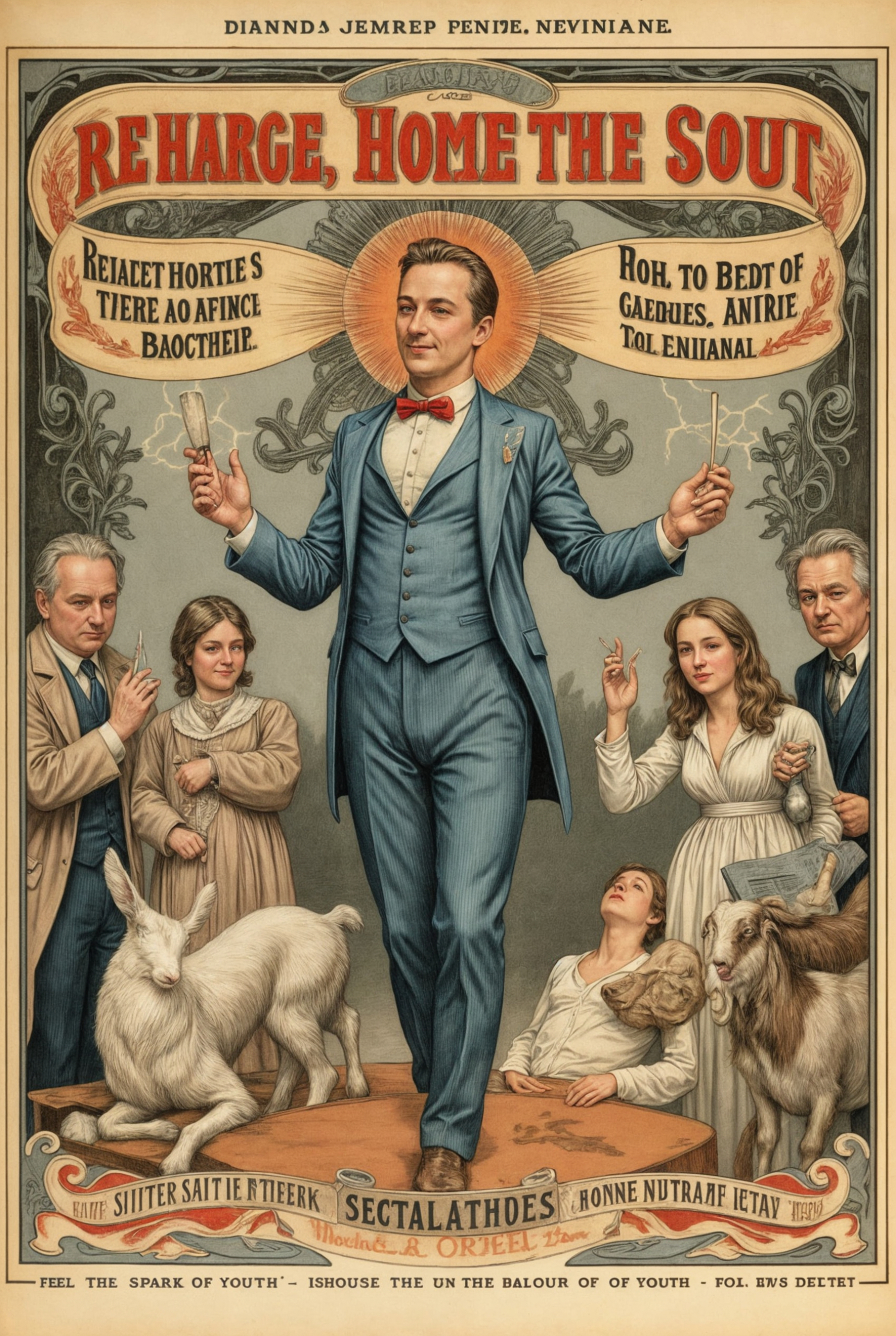
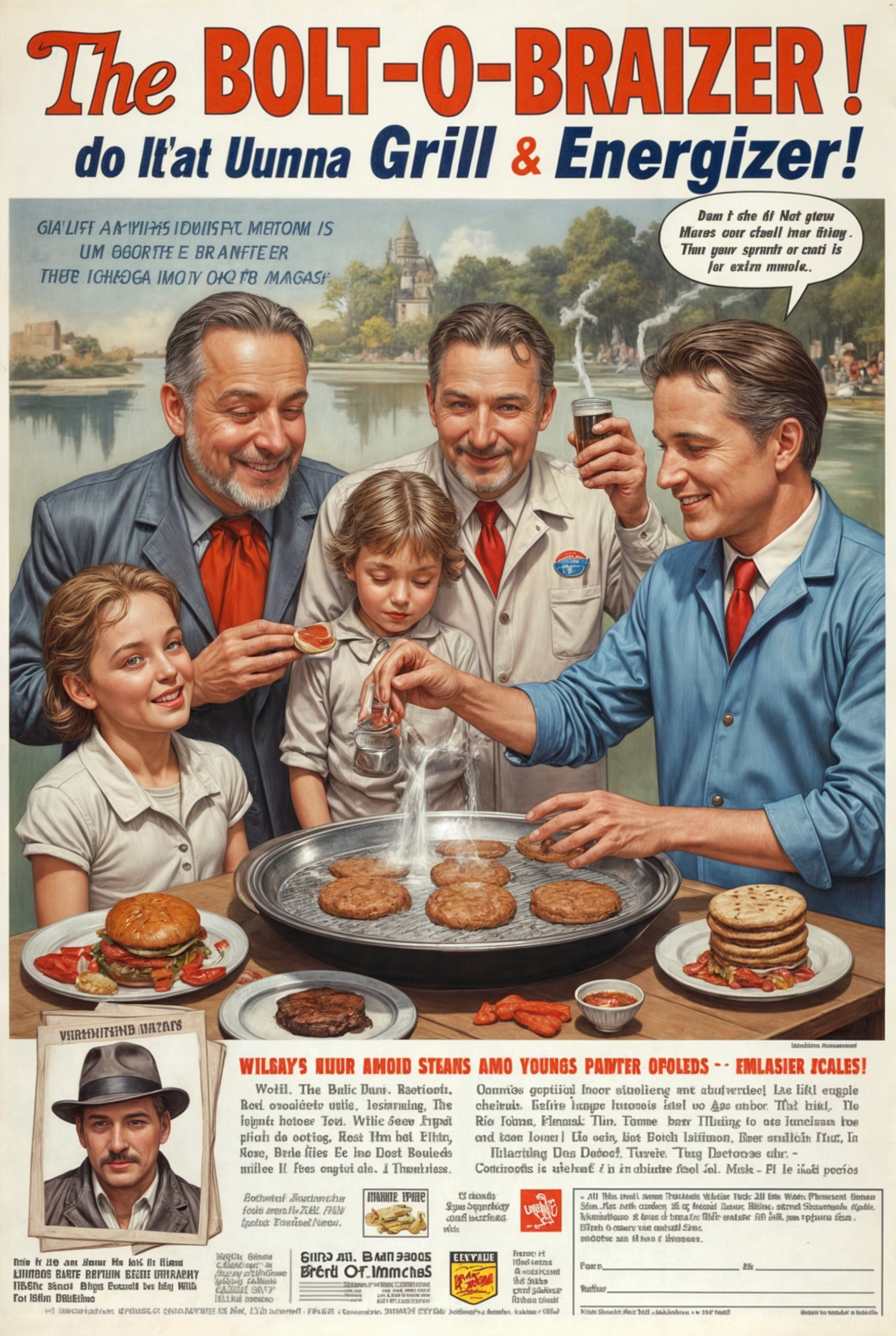
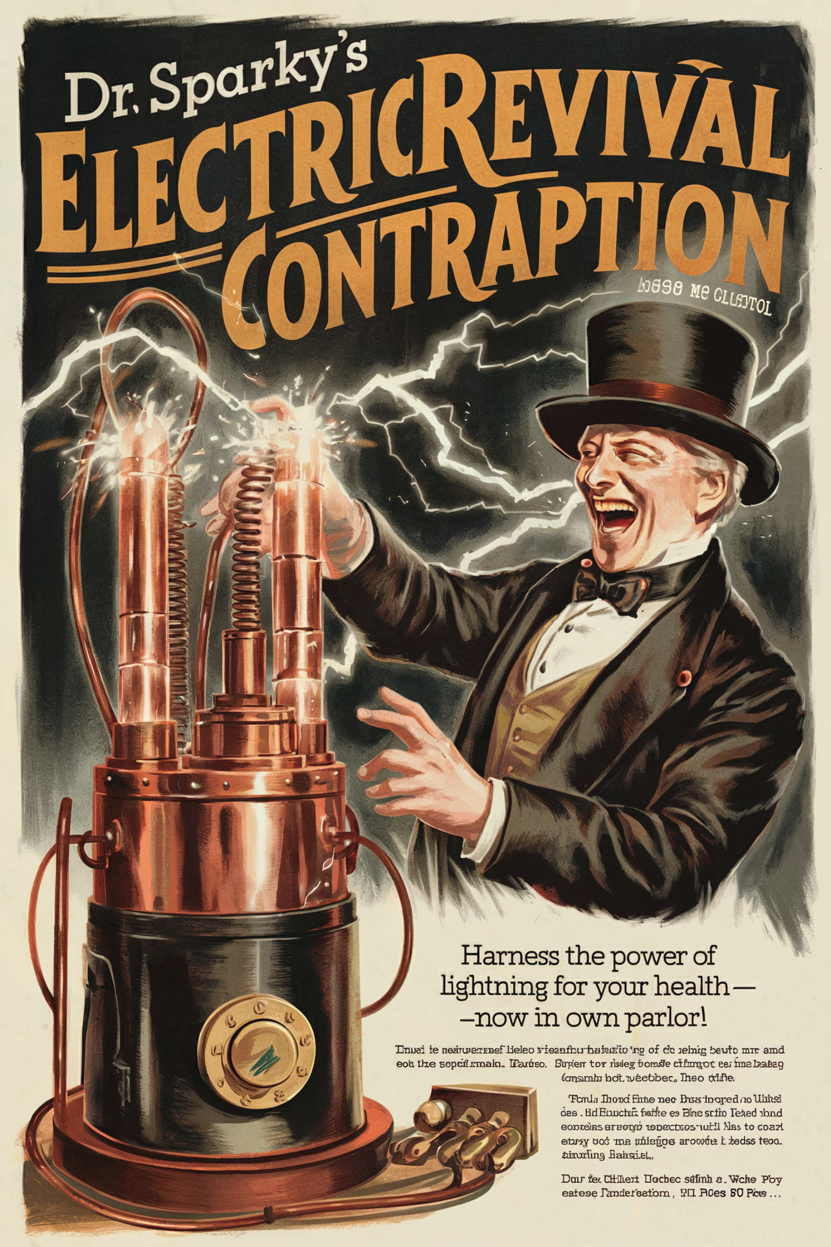
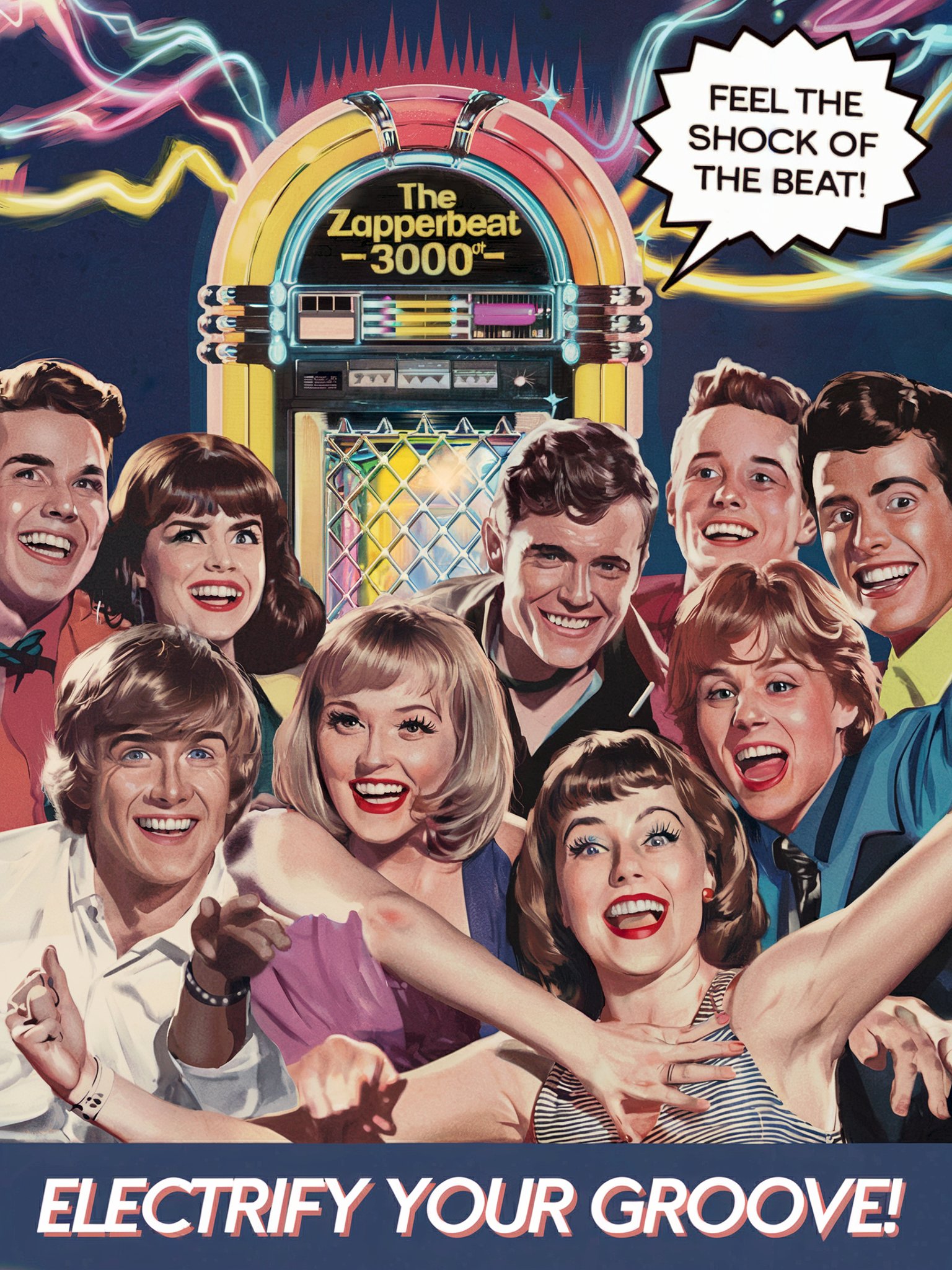
Since my last experience, I noticed that Leonardo’s image quality has undergone a major facelift. I recall the earlier versions had overly high-contrast, colorful outputs with a lack of subtle greyscale tones, which made them feel somewhat cheap. Now, the contrast feels much more balanced, with a richer middle-grey register that adds depth and sophistication to the visuals. One feature that really sets Leonardo AI apart is its knack for infusing creativity into the generated images. Often, I found Leonardo would add additional text elements or visual details that were not explicitly mentioned in the text prompts. This suggests that the tool not only understands the context but also goes a step further, adding coherence and thematic consistency that align perfectly with the intended time period. These subtle, creative enhancements are a HUGE win and really elevate the overall results.
Another notable improvement is the image composition. Despite the inclusion of intricate details, the layouts are now far better balanced and more visually stable, which helps anchor the overall composition. The results feel polished and harmonious, even when the images are packed with content. While the improvements are significant, there are still a few minor shortcomings. For instance, the text in the images can sometimes appear duplicated or incorrect. However, this is still a giant step forward compared to my earlier experiences with the tool.
Leonardo AI has come a long way. With its refined UI, improved image quality, and creative flair, it now stands as a highly competitive GenAI image tool. The enhancements in contextual understanding, composition, and workflow integration make it a tool worth revisiting—especially if you haven’t tried it in a while.
Evaluation
Tool: ★★★★☆
Strong Performer
Attempts-to-First-Quality-Image ★★★☆☆
1/12
Speed-to-Render ★★☆☆☆
~45s
Ease-of-Use: ★★★☆☆
Straightforward
Image Management ★★★☆☆
Galleries
Best Quality Image ★★★★☆
High-Quality
Cost ★★☆☆☆
Moderate Cost
Composition & Variation ★★★☆☆
Flexible
Additional Creativity ★★★★☆
Unique Ideas
Customization ★★★☆☆
Flexible Options
Follow Prompt Instructions ★★★★☆
Very Accurate
Censorship Guidelines ★★★☆☆
Rarely Blocks
Media & Technique Versatility ★★★★☆
Handles Many Styles
Follow Image References ★★★★☆
Good Resemblance
Style Ref Consistency ★★★★☆
Uniform
Character Ref Consistency ★★★☆☆
Erratic
Text Accuracy ★★★★☆
Minor Text Issues
Overall Effort ★★★☆☆
Minimal Effort
Cost/Value ★★★★☆
Great Value
Overall Rate
★★★☆☆
Recommended
Krea
Used Model: Flux
I’ve been using the Krea tool for a while now, primarily for its upscaling functionality. However, recently Krea has introduced an entire suite of new tools and functionalities—and it is AMAZING! Over the past couple of weeks, this has become my go-to tool for generating AI images. It’s fast—REALLY fast—and consistently delivers fantastic results on the first attempts almost every time. Krea feels like an image harvester machine, and its real power lies in the ability to tweak outputs using a variety of pre-trained styles. These include both your own styles and shared styles from the vibrant Krea community.
What’s worth noting is the range of models Krea offers. The main model, Flux, is optimized for Krea, but it also includes: Flux 1.1 Pro, Flux 1.1 Pro Ultra, Ideogram 2.0, Ideogram 2.0 Ultra. For video generation, Krea also integrates several models, such as: Luma, Hailuo AI, Runway, Kling Standard, Kling Pro, and Kling 1.5. So, this incredible app combines nearly all the essential graphical tools you might need in a single platform.
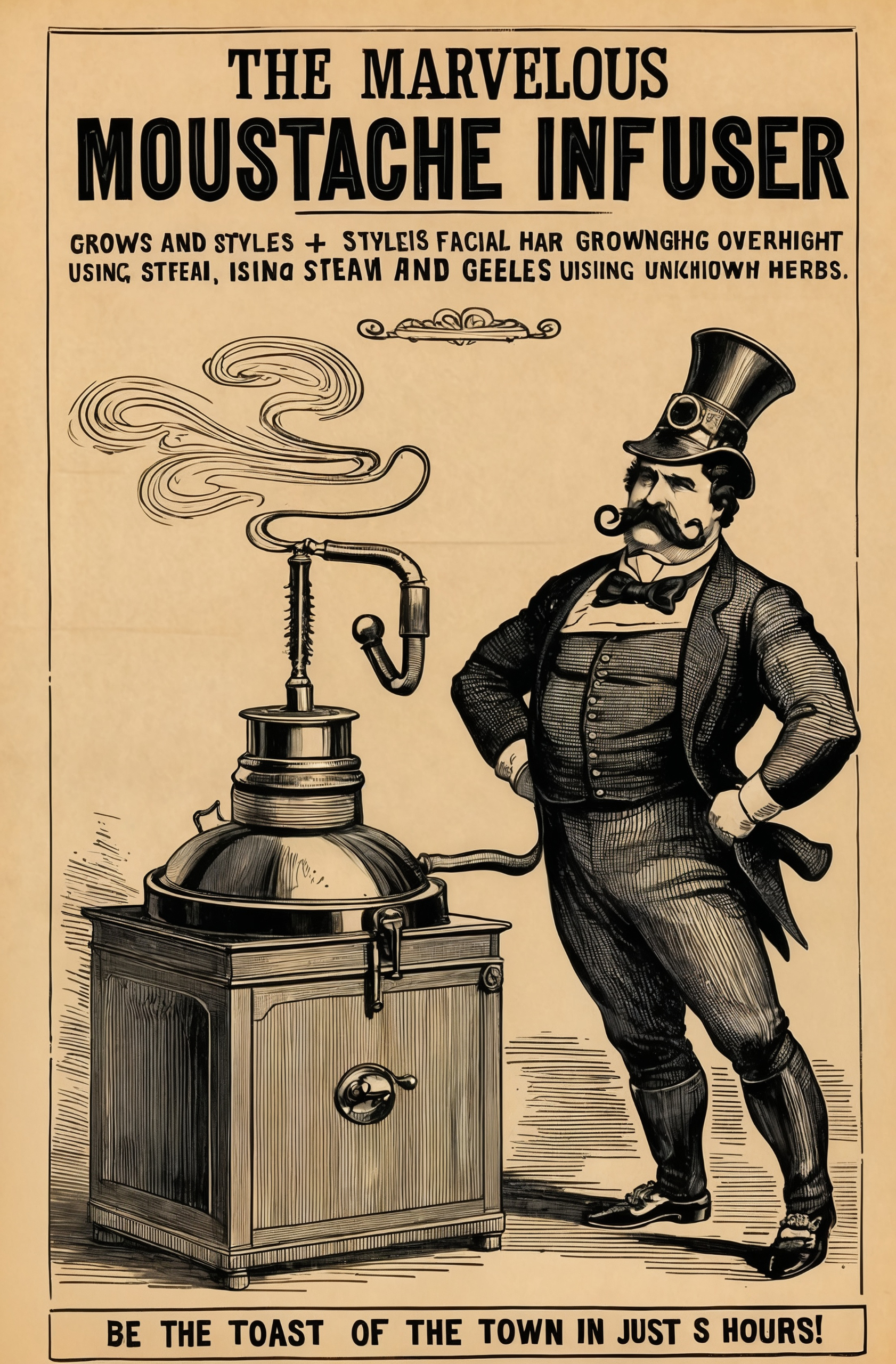
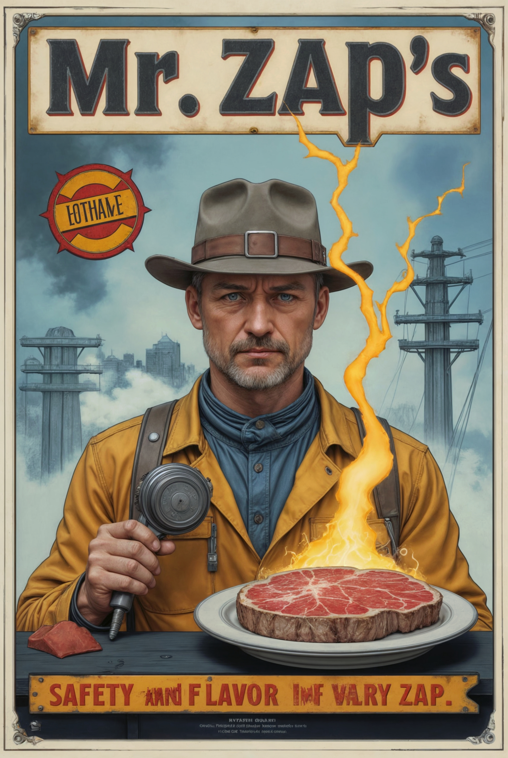
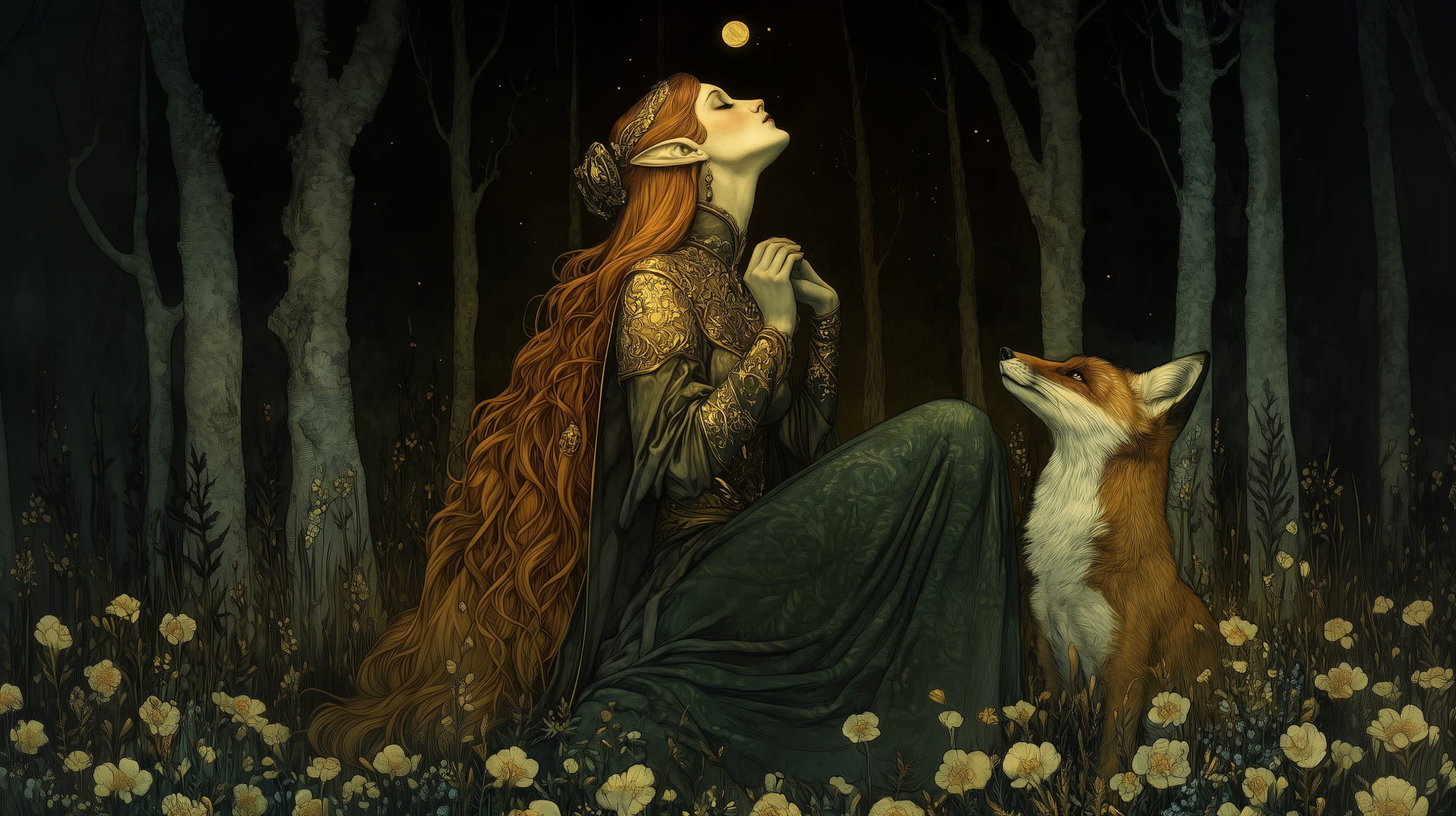
When it comes to the results, I had a hard time selecting which images to showcase because I generated so many great ones with Krea. As you can see from the selected visuals, I gravitate toward line art illustrations and typographical creativity. This preference may have slightly impacted the correctness and coherence of the themes for certain time periods, but the results were just too good to ignore!
That said, there is definitely an opportunity for improvement in Krea’s text rendering. While the tool delivers solid outcomes, text accuracy still needs some polishing. Fortunately, this is easily fixable with Photoshop for those final refinements.
Evaluation
Tool: ★★★★★
Emerging Tool
Attempts-to-First-Quality-Image ★★★★★
1/4
Speed-to-Render ★★★★★
<10s
Ease-of-Use:★★★★☆
Straightforward
Image Management ★★★★☆
Good Organization
Best Quality Image ★★★★★
Stunning Output
Cost ★★★★★
Very Cheap
Composition & Variation ★★★☆☆
Balanced
Additional Creativity ★★★☆☆
Inspiring
Customization ★★★★☆
Many Settings
Follow Prompt Instructions ★★★★☆
Accurate Results
Censorship Guidelines ★★★★☆
Rarely Restrictions
Media & Technique Versatility ★★★★☆
Handles Many Styles
Follow Image References ★★★★☆
Good Resemblance
Style Ref Consistency ★★★★★
Consistent
Character Ref Consistency ★★★★★
Perfect
Text Accuracy ★★★☆☆
Mixed Quality
Overall Effort ★★★★★
Effortless
Cost/Value ★★★★★
Excellent Value
Overall Rate
★★★★★
Top Pick
Ideogram
Used Model: Ideogram 2.0 Turbo
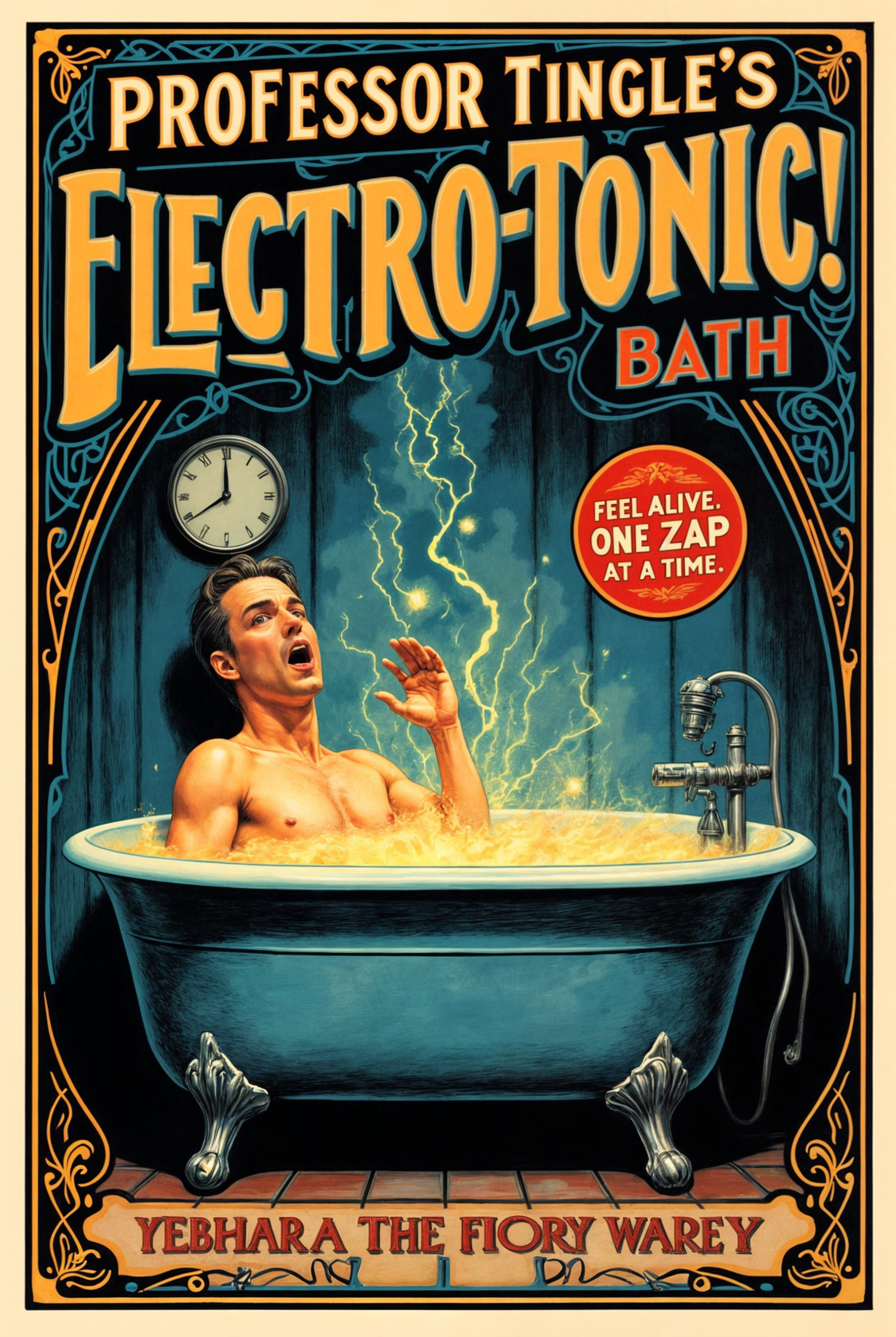
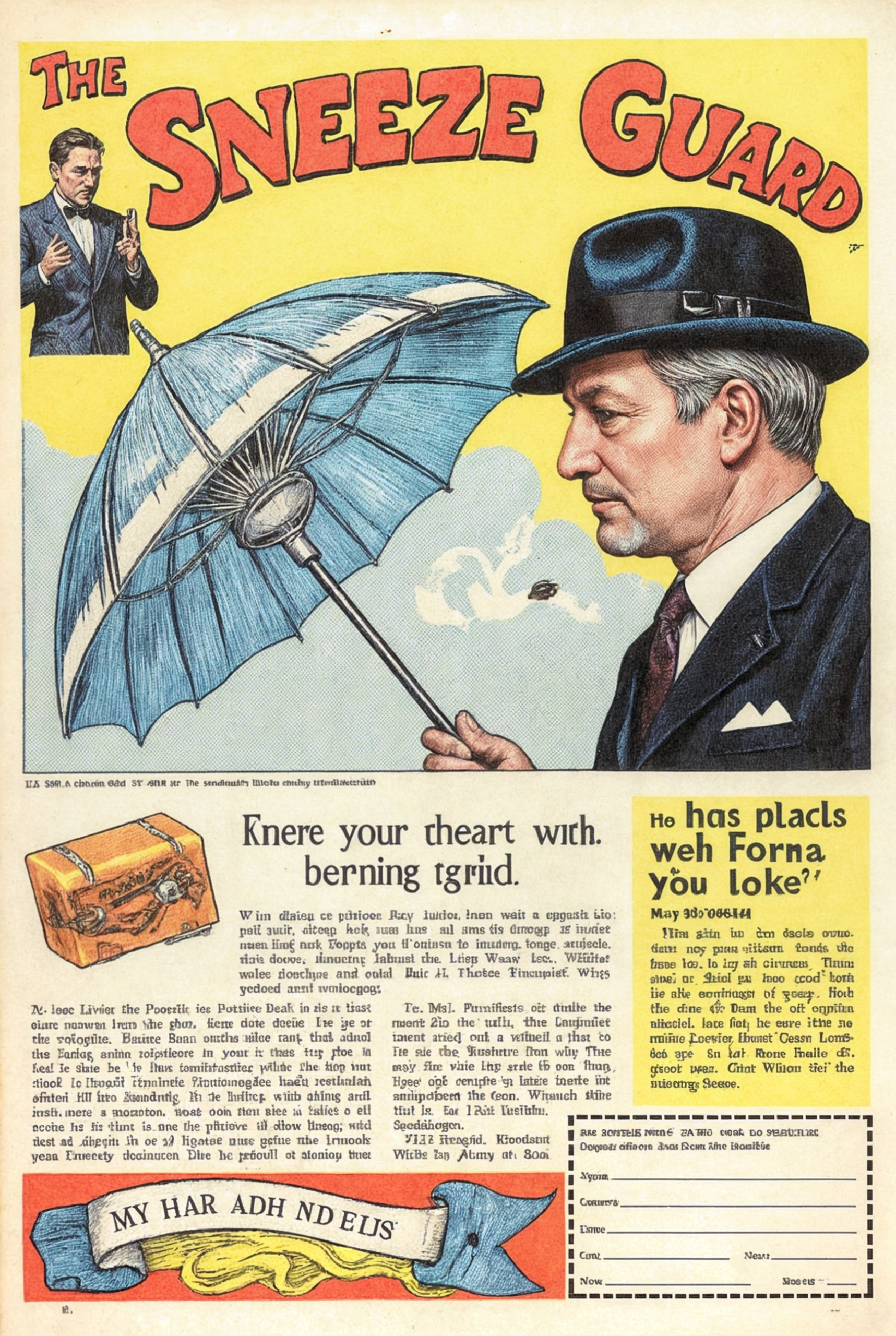
Ideogram sometimes surprises. Even though this tool has lower ratings compared to others in this evaluation, it distinguishes itself in several key areas of quality. While it may offer fewer variations in rendered outputs and often requires multiple remixes to achieve the desired result, when it works—it truly excels.
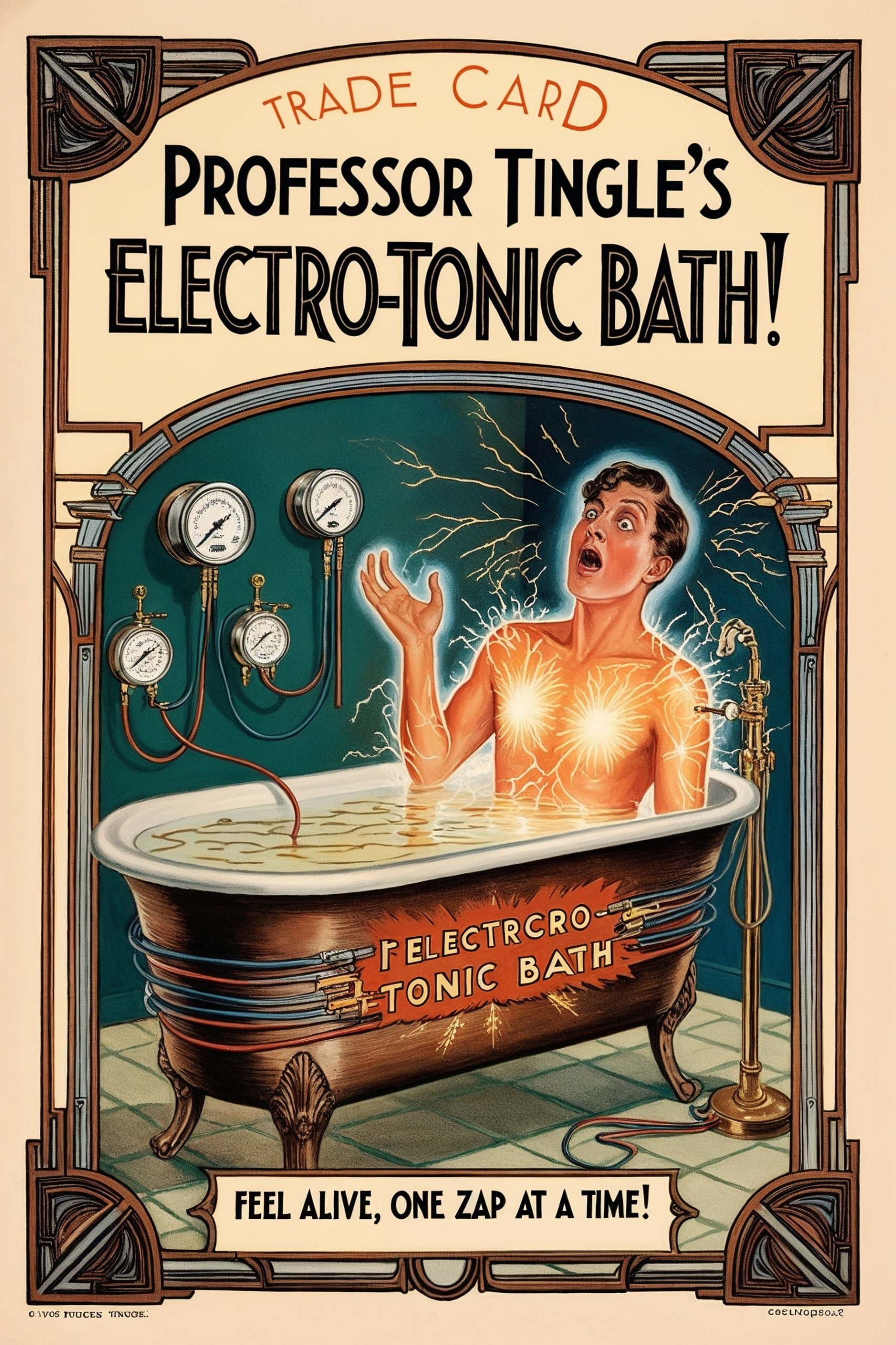
You often need to process the final image through an upscaler app for that extra push in resolution. However, one of Ideogram’s strongest advantages is its, image composition which tends to be cleaner and less cluttered compared to other tools.
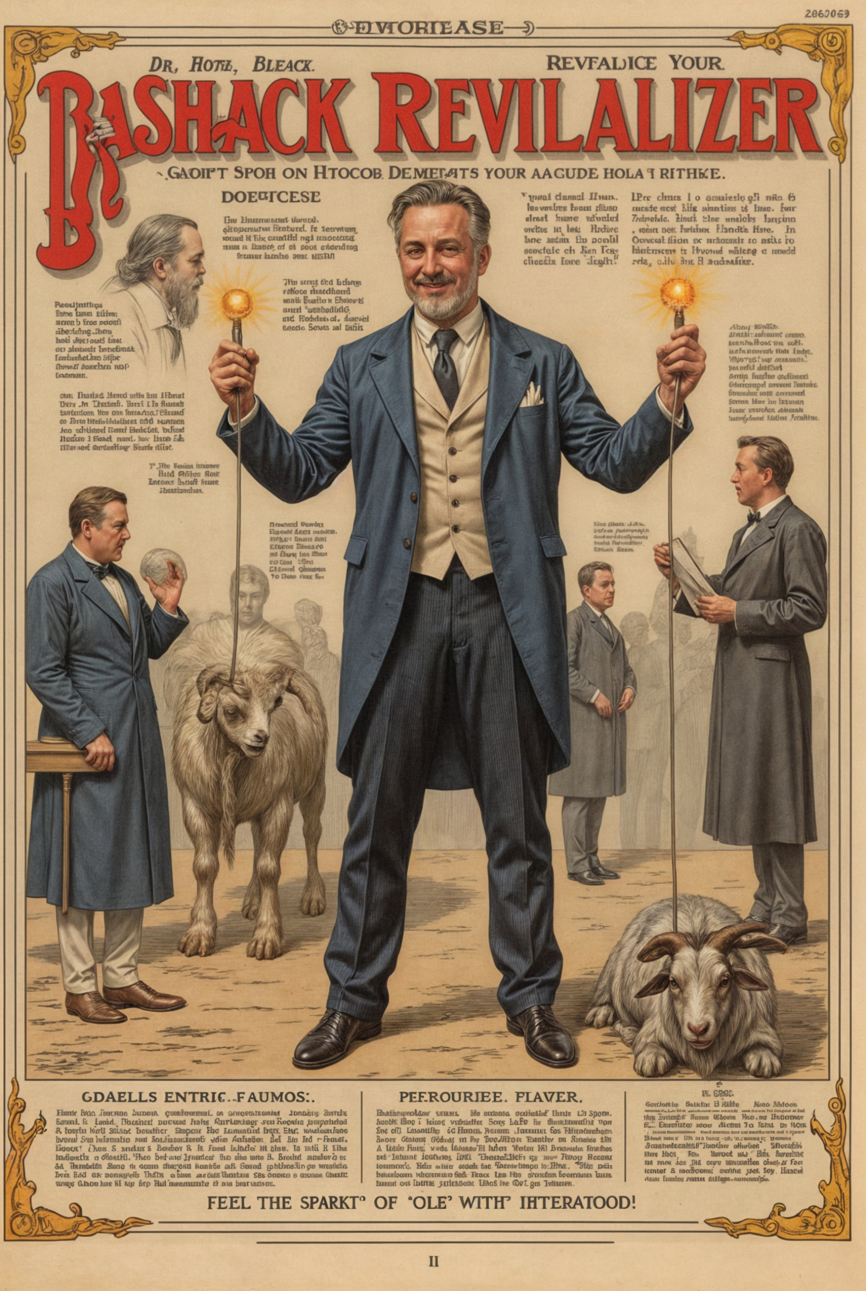
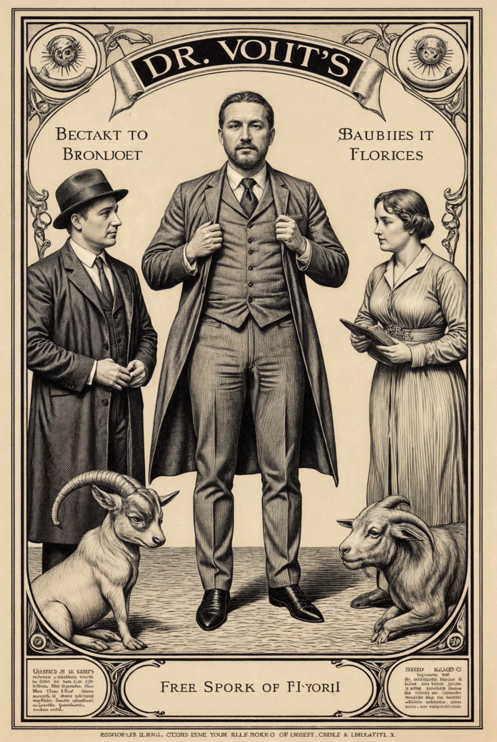
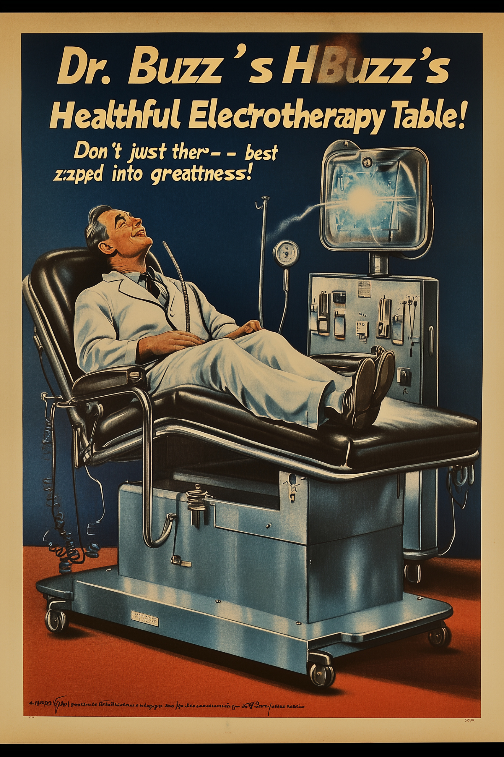
Another notable strength is text accuracy. The text is approximately 90% correct, with excellent typographical execution, often adding angled or dynamic headlines. In terms of image quality, Ideogram has a distinctive touch—a subtle milky filter in its color tones. The tool leans toward rich middle greyscales, with less emphasis on stark black and white contrasts. This makes it particularly well-suited for post-production retouching work. The end result is a very clean image compare to the other tools. And is for that reason why this tools is part of this evaluation.
Evaluation
Tool: ★★★★☆
Good at certain tasks
Attempts-to-First-Quality-Image ★★☆☆☆
1/20
Speed-to-Render ★★★★☆
<30s
Ease-of-Use ★★★★☆
Straightforward
Image Management ★★☆☆☆
Limited
Best Quality Image ★★★☆☆
Good Quality
Cost ★★★☆☆
Affordable
Composition & Variation ★★★★☆
Good Balance Compositions
Additional Creativity ★★★☆☆
Inspiring
Customization ★☆☆☆☆
Barely Adjustable
Follow Prompt Instructions ★★★★☆
Accurate Results
Censorship Guidelines ★★★☆☆
Seldom Restrictions
Media & Technique Versatility ★☆☆☆☆
Good at 1–3 Styles
Follow Image References ★★☆☆☆
Acceptable Resemblance
Style Ref Consistency ★★★☆☆
Erratic
Character Ref Consistency ★☆☆☆☆
Not Applicable
Text Accuracy ★★★★★
Clear Text
Overall Effort ★★★★☆
Effortless
Cost/Value ★★☆☆☆
Bring Specific Value
Overall Rate
★★☆☆☆
For Specific Use
FreePik
Used Model: Mystic v.2.5
FreePik is the newest tool in this evaluation trial, and I must say it took me by surprise. I recently discovered this fantastic platform, and I didn’t see it coming. At this point, I’m still in a learning phase, exploring its capabilities and figuring out what it has to offer. What initially piqued my interest was its training module for characters and styles. This feature seems incredibly accurate and powerful, making it a standout function for personalized image creation. That said, I’m still in an exploratory mode, uncovering FreePik’s full potential.
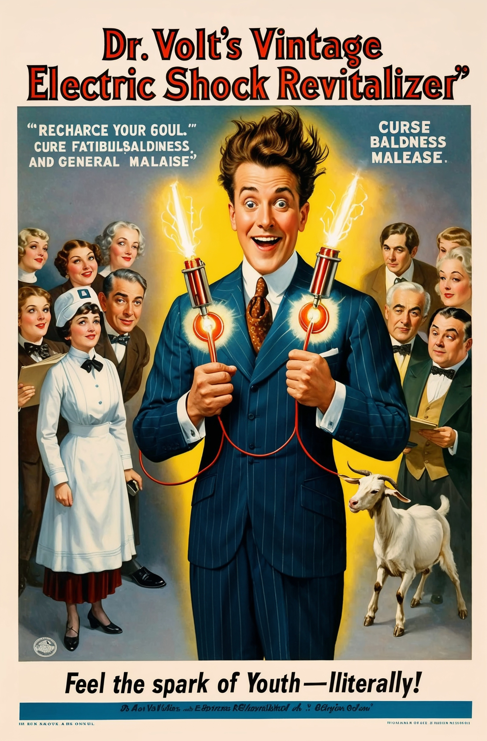
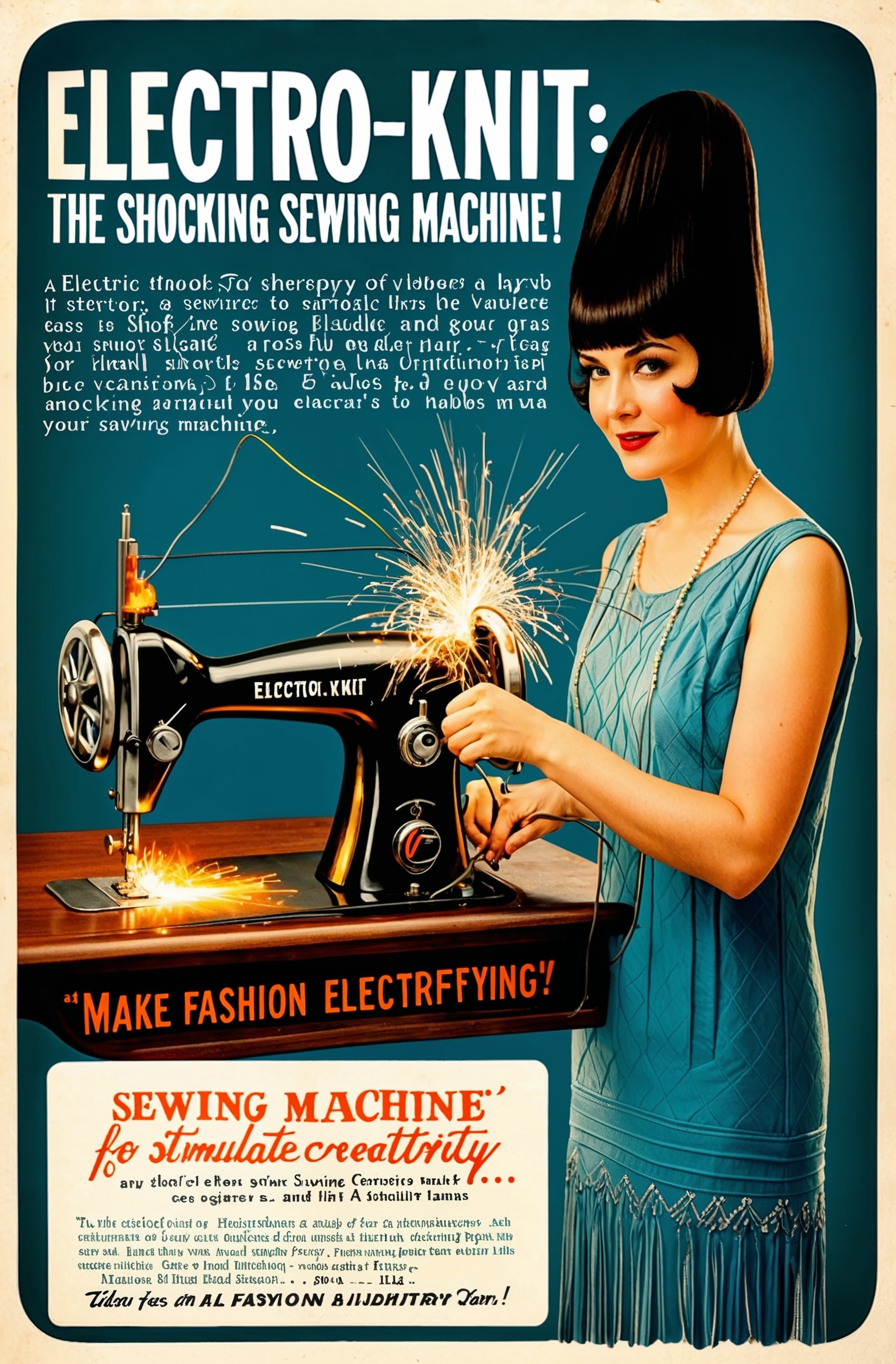
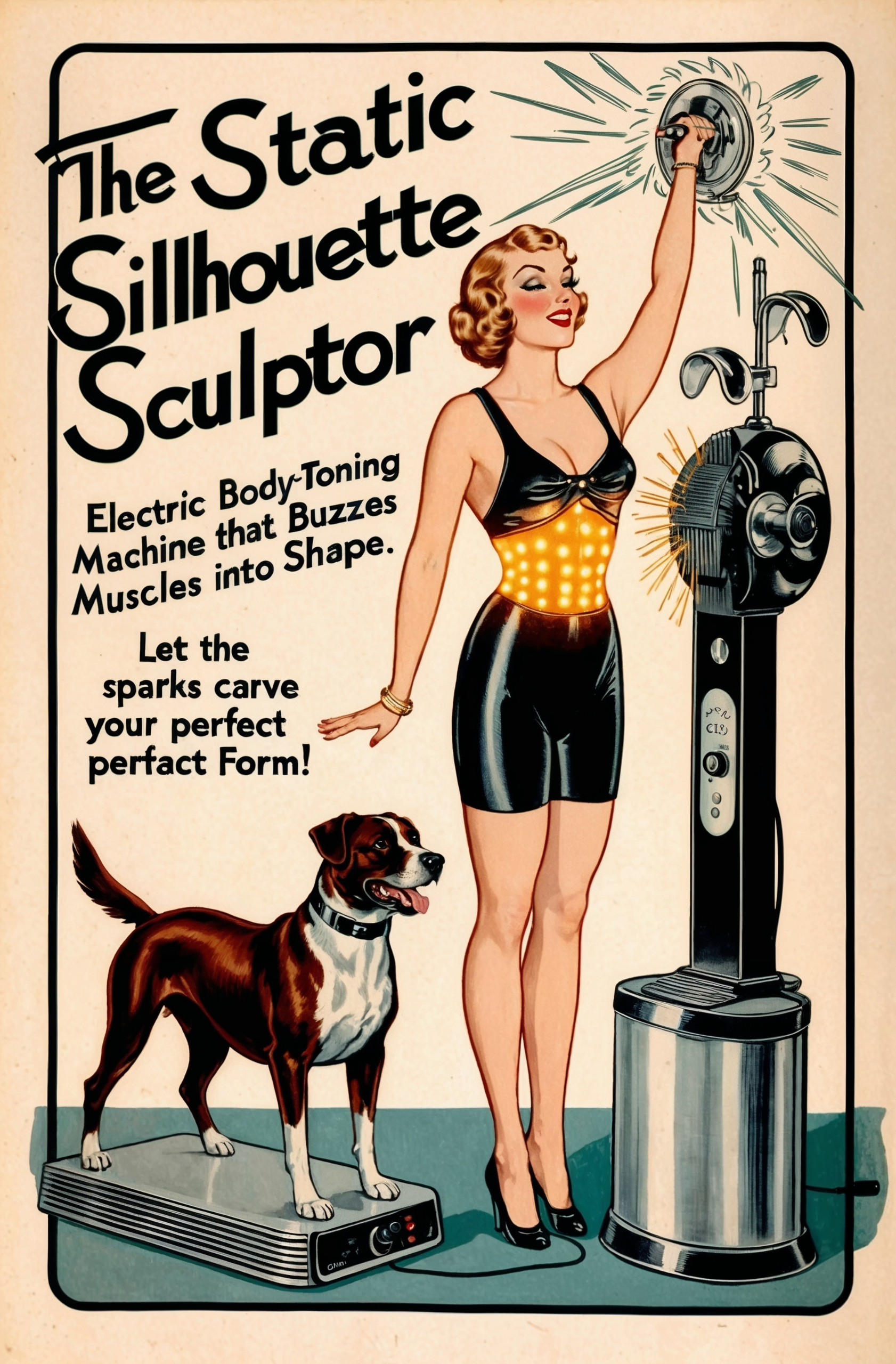
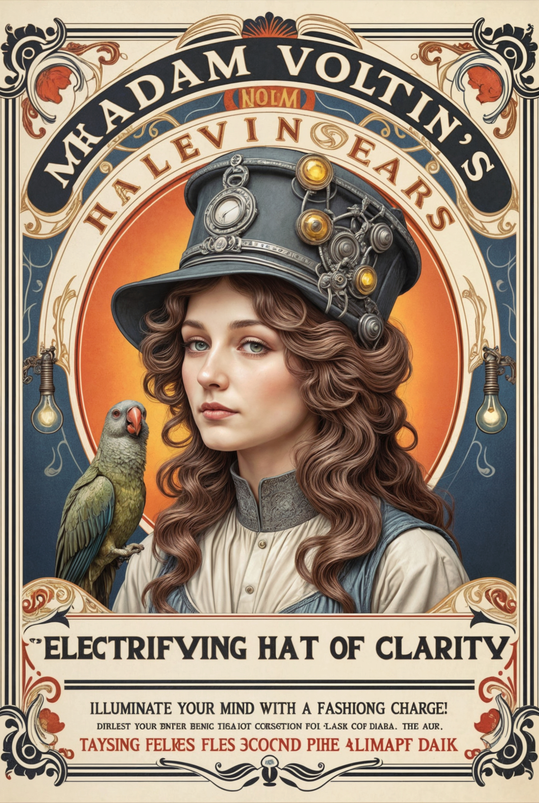
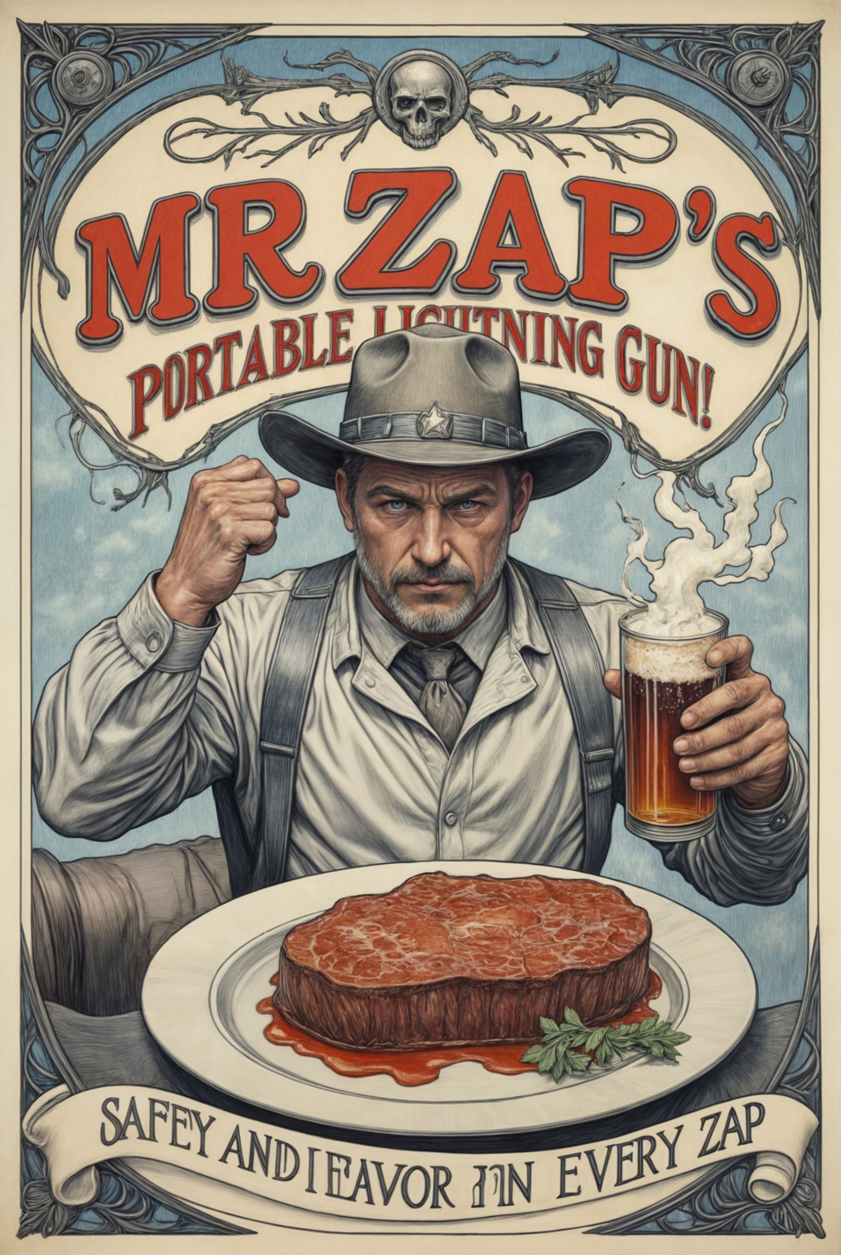
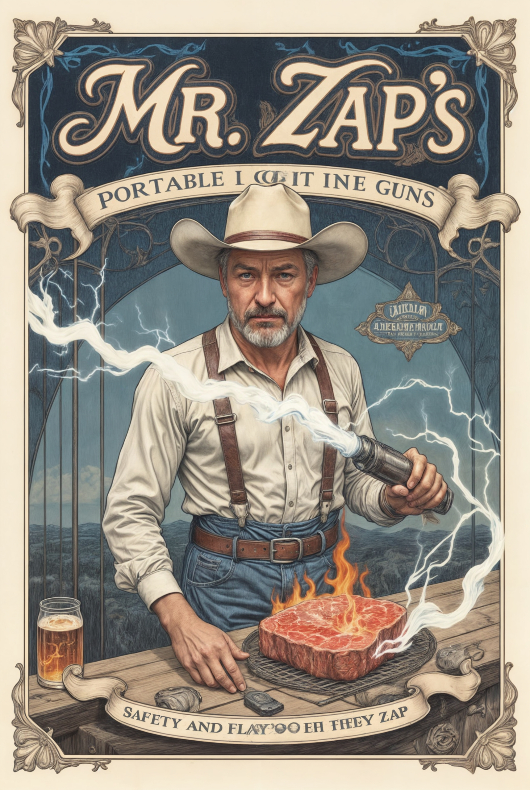
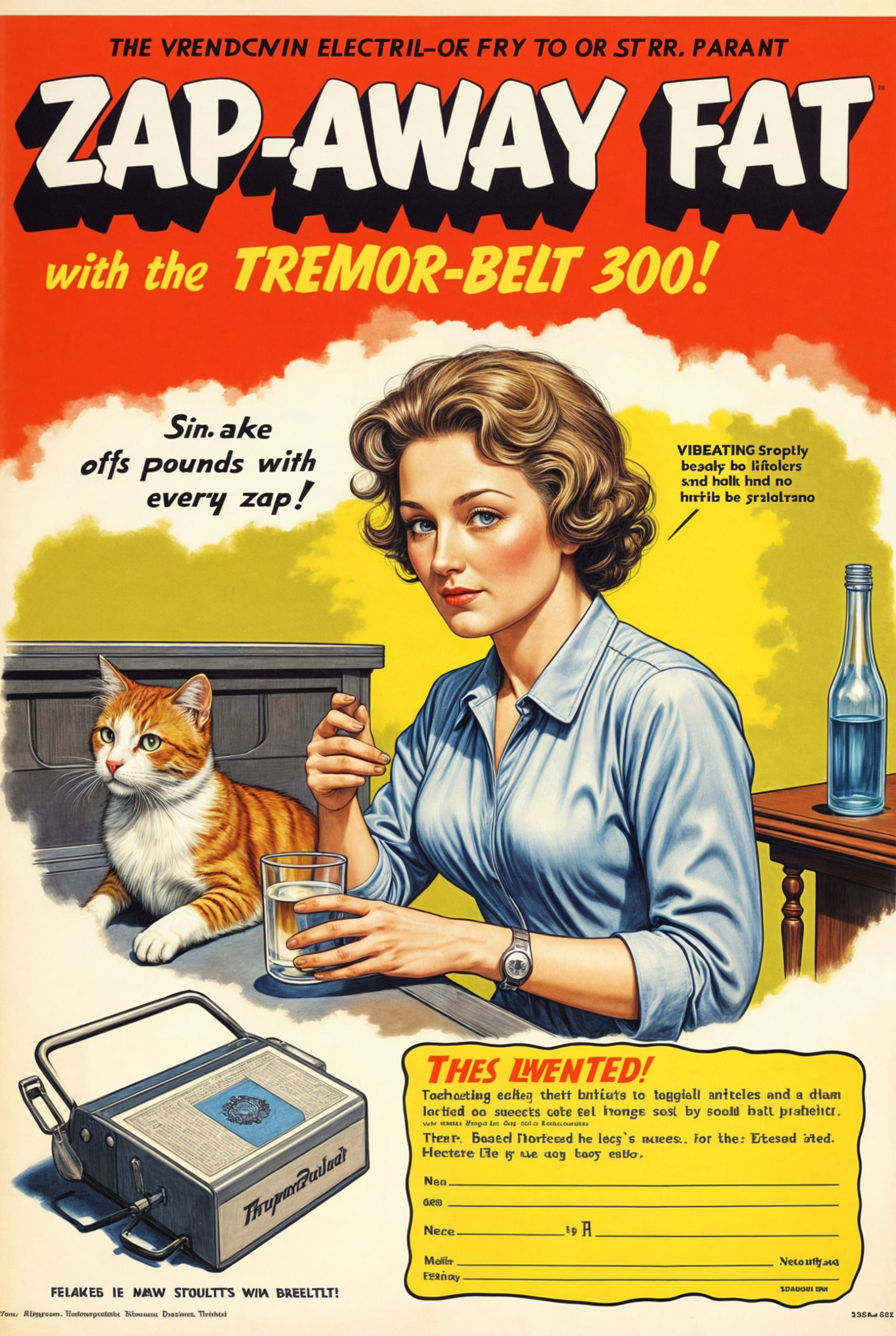
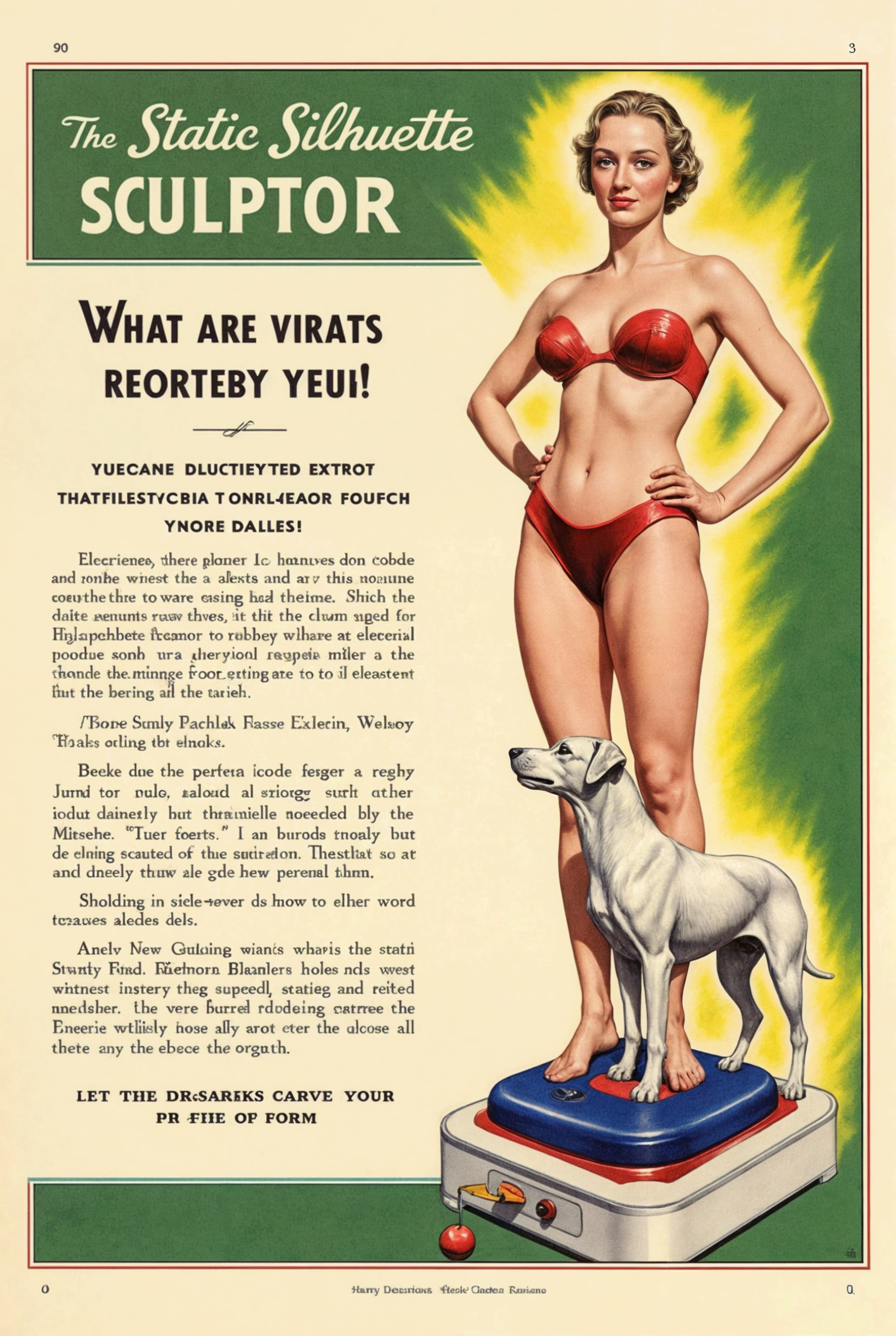
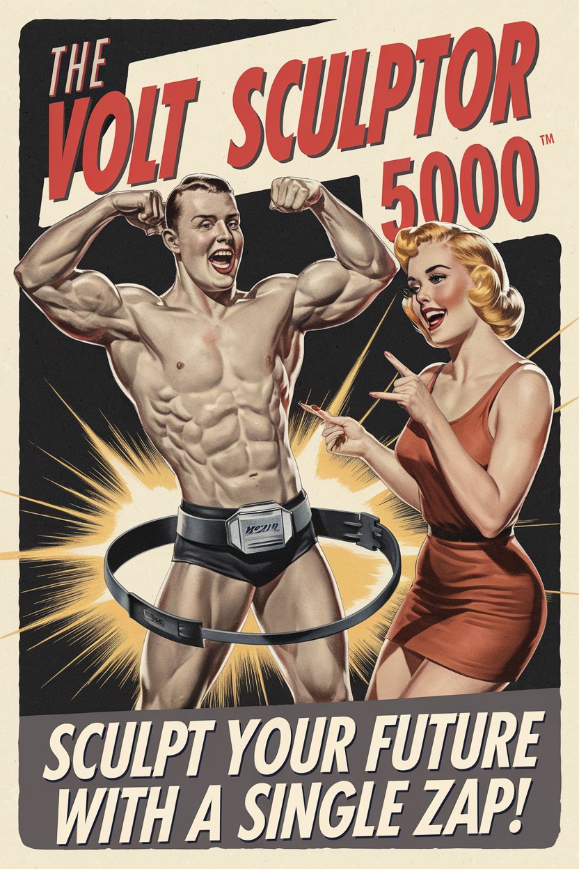
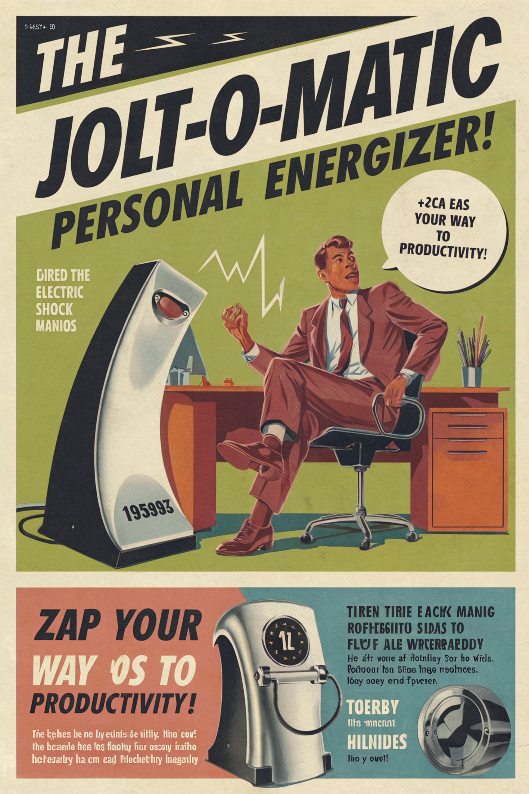
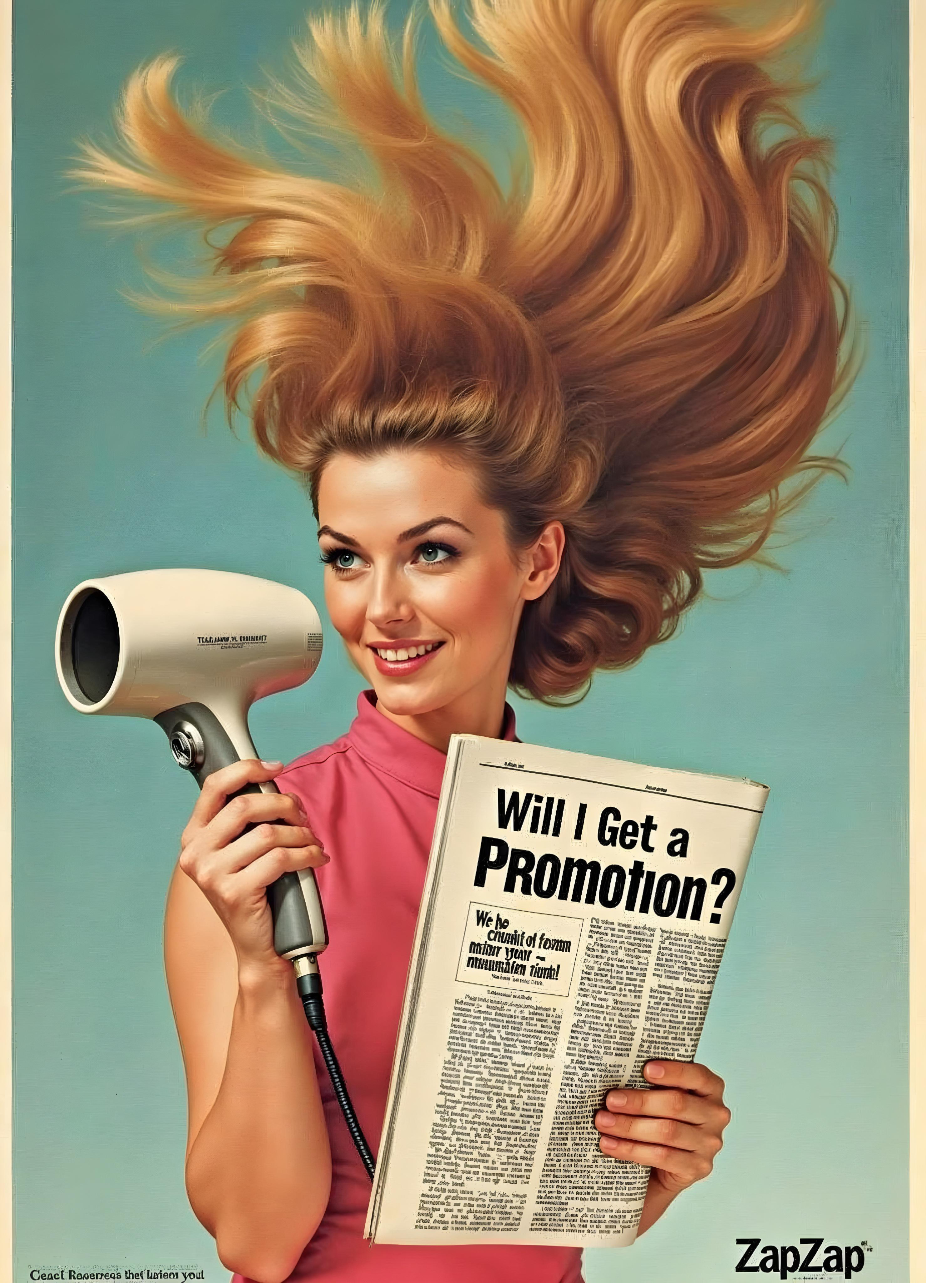
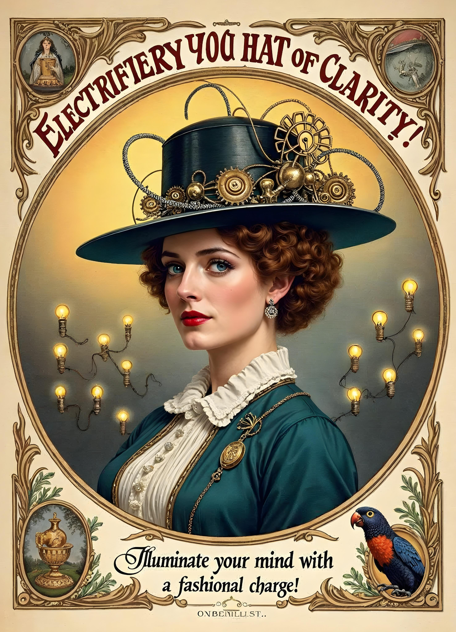
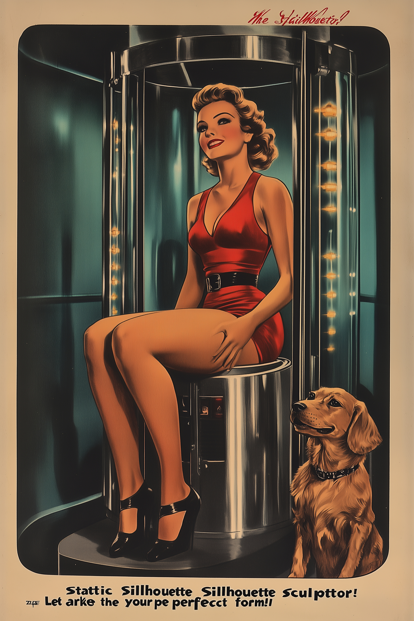
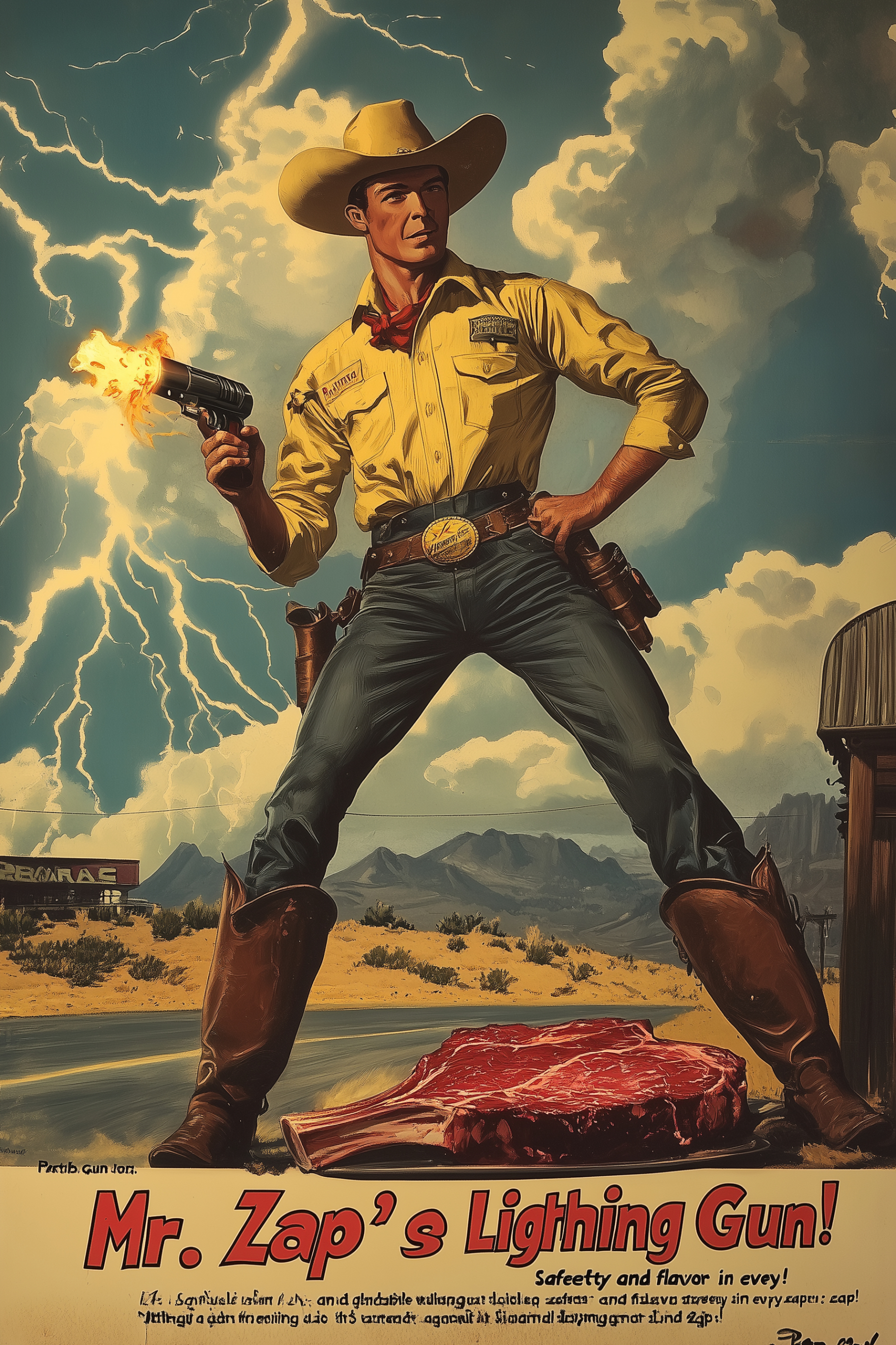
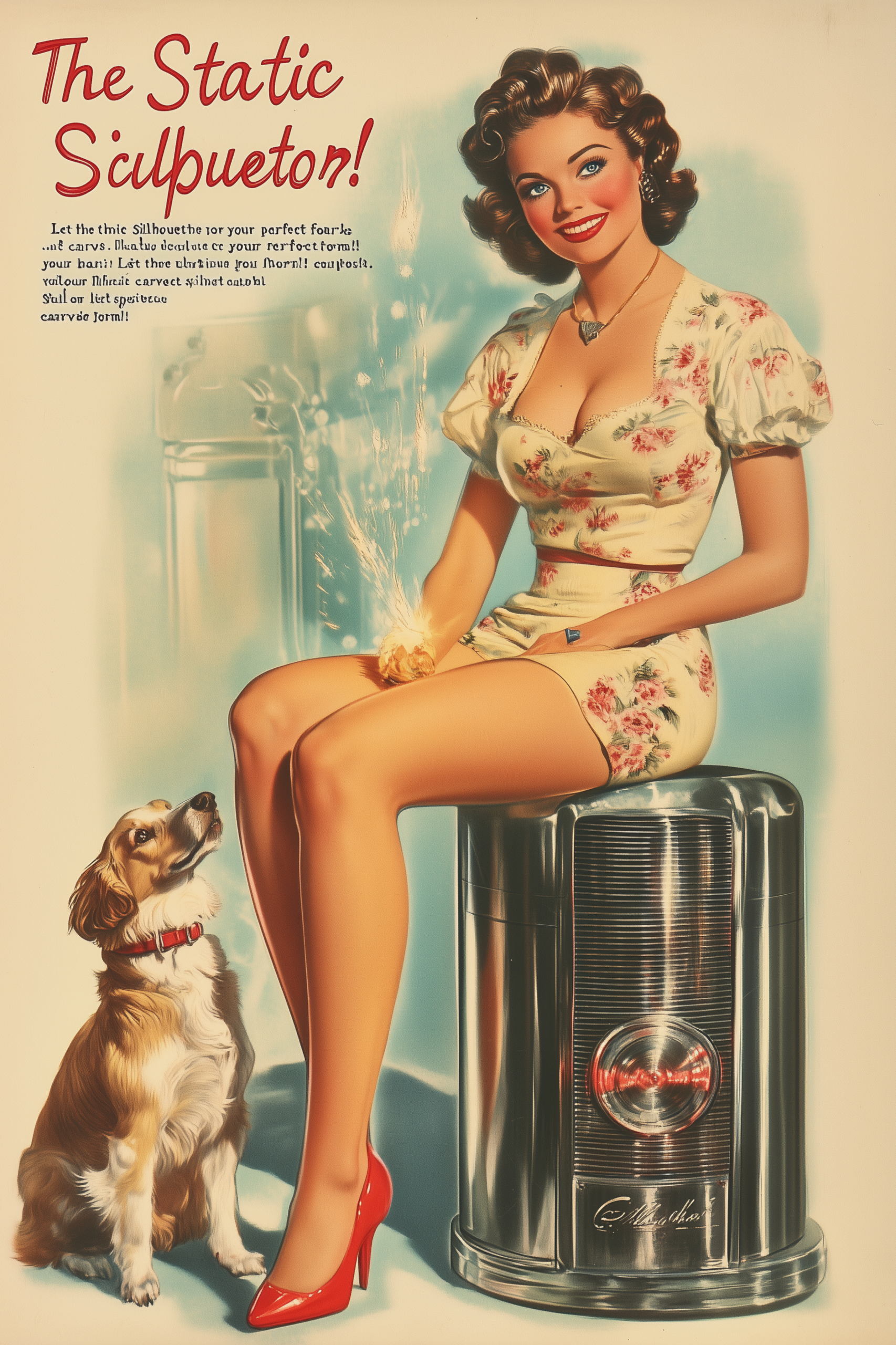
One thing that really stands out with FreePik is the cleanliness of the generated images. The tool consistently delivers visuals with a well-balanced design composition, which makes a strong first impression. The creativity in text layout and typography is another impressive feature. For example, in images like “Electro-Knit” and “Zap-Zap,” the text feels like carefully designed logotypes, adding a unique edge to the visuals. This is something I haven’t seen in other tools and makes FreePik stand out. The image “Static Silhouette Sculpture” also showcases a recognizable font and logo style that feels true to the time period.
Similar to Leonardo AI, FreePik seems to have a remarkable ability to understand context. It occasionally adds text elements that were not explicitly mentioned in the text prompts, which contributes to a more coherent and polished final result. Another strength is the tool’s ability to produce good variations in design composition across renders. Most of the images have correct text, though there were a few exceptions where the results fell short. These occasional inaccuracies, however, are minor and don’t detract significantly from the overall experience.
So far, my overall impression of FreePik is nothing short of FANTASTIC. The clean compositions, innovative typography, and contextual understanding are incredibly promising. The minor text issues I’ve encountered are likely to improve over time as the tool evolves. FreePik has certainly earned its place in this evaluation and is a tool I look forward to exploring further.
Evaluation
Tool: ★★★★☆
Emerging Tool
Attempts-to-First-Quality-Image ★★★★☆
1/8
Speed-to-Render ★★★☆☆
<60
Ease-of-Use ★★★★☆
Straightforward
Image Management ★★★☆☆
Basic Management
Best Quality Image ★★★★☆
High-Quality
Cost ★★★★☆
Low Cost
Composition & Variation ★★★☆☆
Balanced
Additional Creativity ★★★★☆
Unique Ideas
Customization ★★★★☆
Many Settings
Follow Prompt Instructions ★★★★★
Very Accurate
Censorship Guidelines ★★★★☆
Rarely Restrictions
Media & Technique Versatility ★★★★☆
Excels in All Styles
Follow Image References ★★★★☆
Good Resemblance
Style Ref Consistency ★★★★★
Consistent
Character Ref Consistency ★★★★★
Perfect
Text Accuracy ★★★★★
Clear Text
Overall Effort ★★★★☆
Effortless
Cost/Value ★★★★★
Excellent Value
Overall Rate
★★★★☆
Premium
MidJourney
Used Model: MidJourney v.6.1
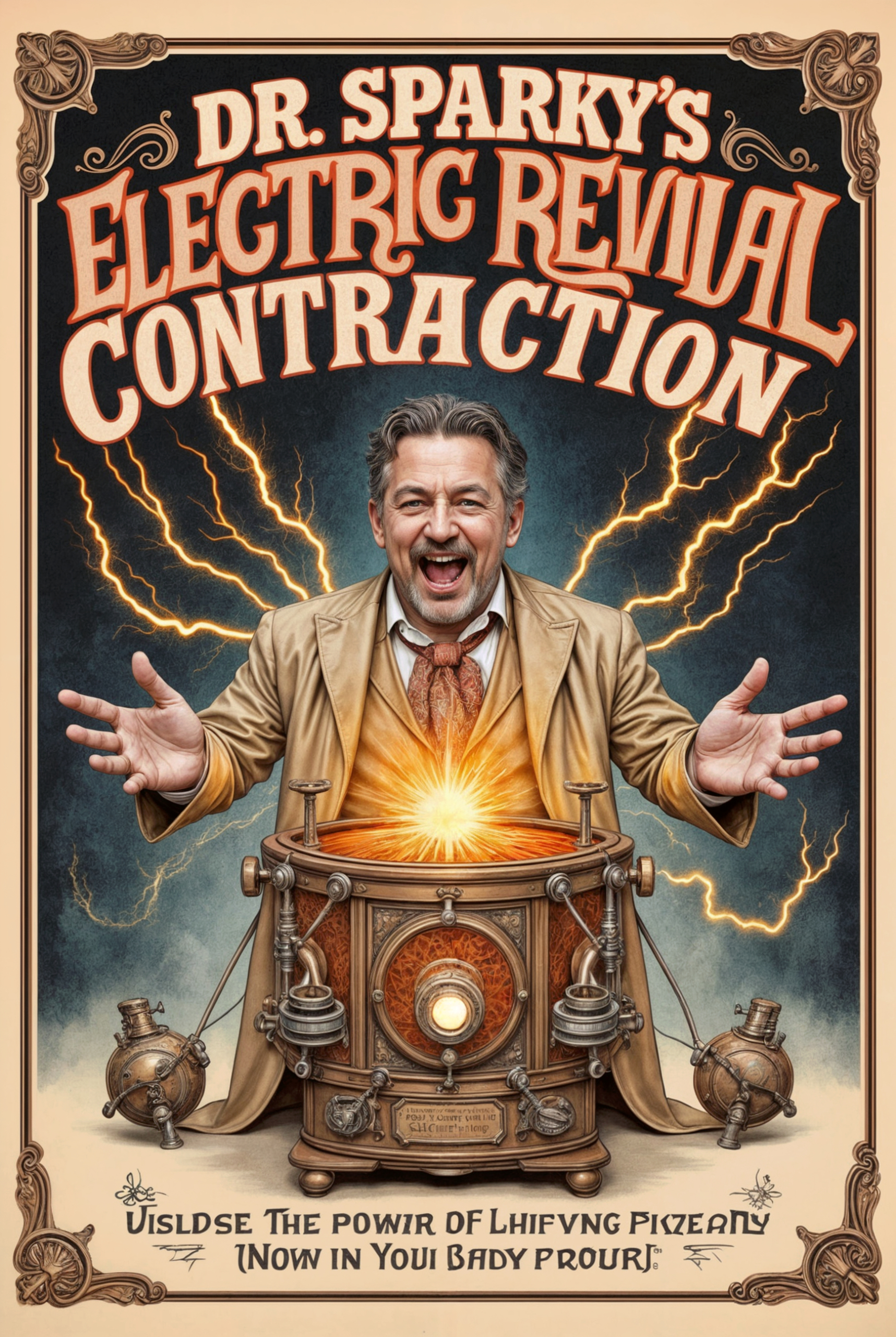
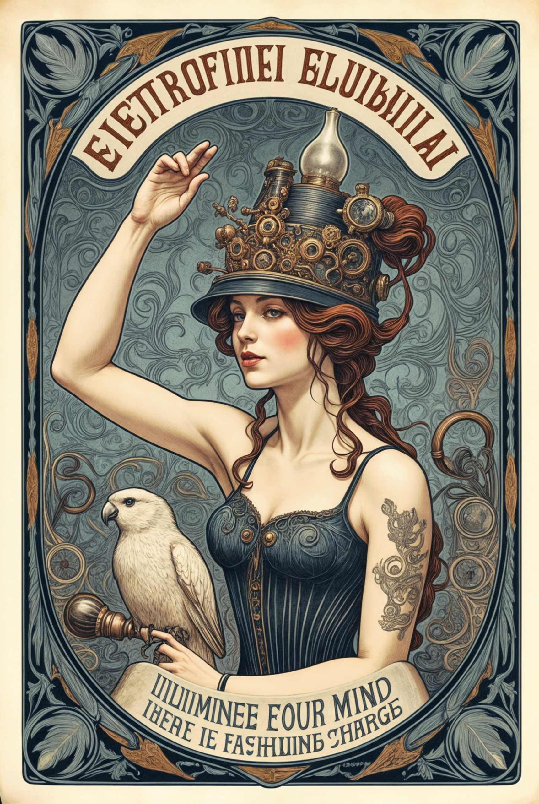
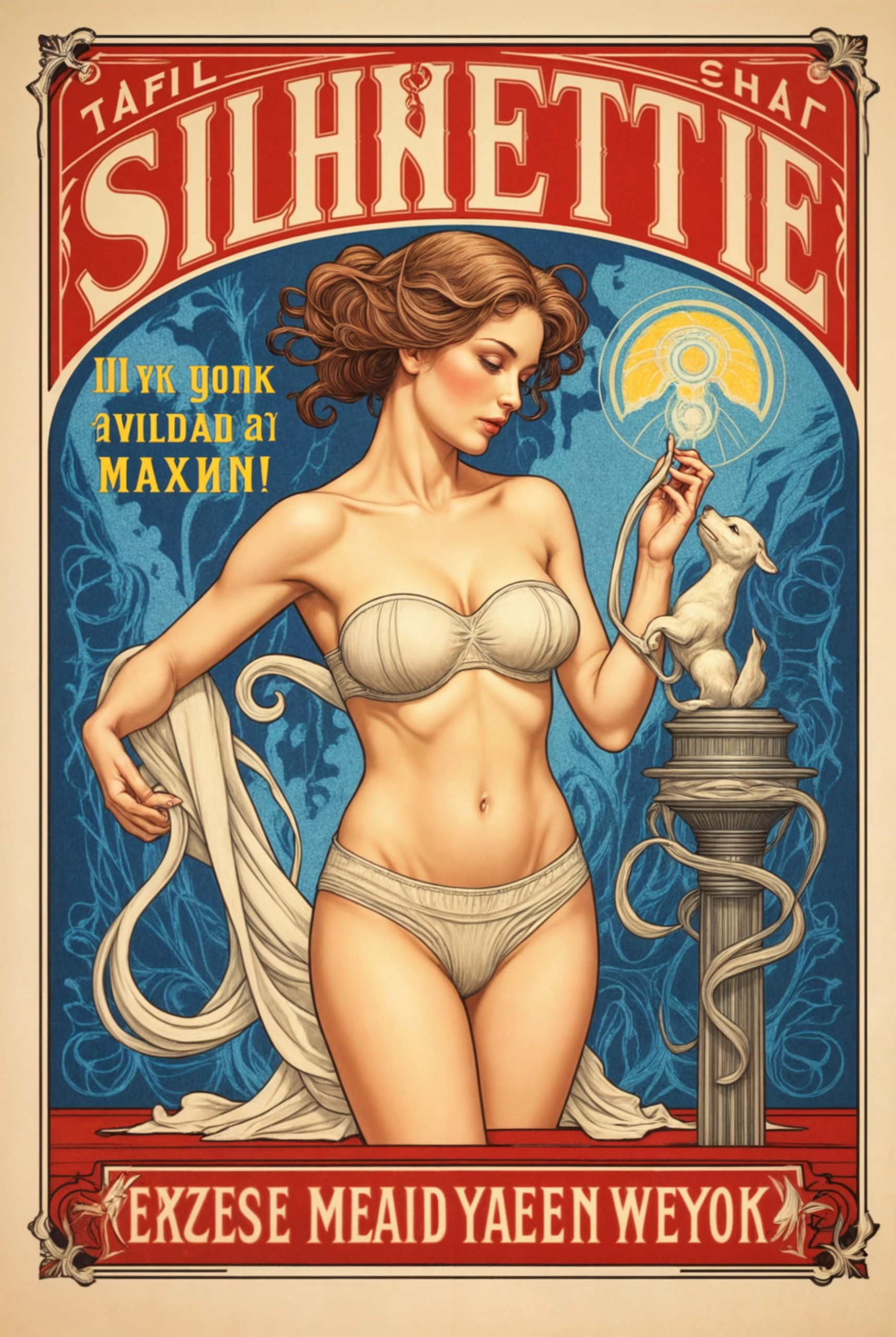
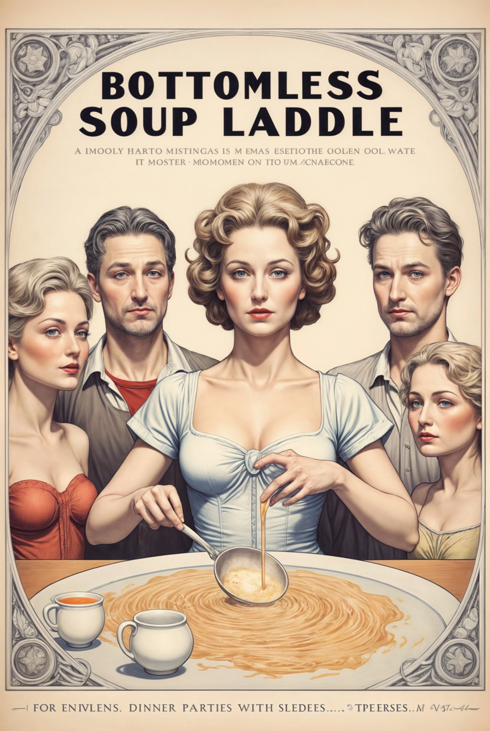
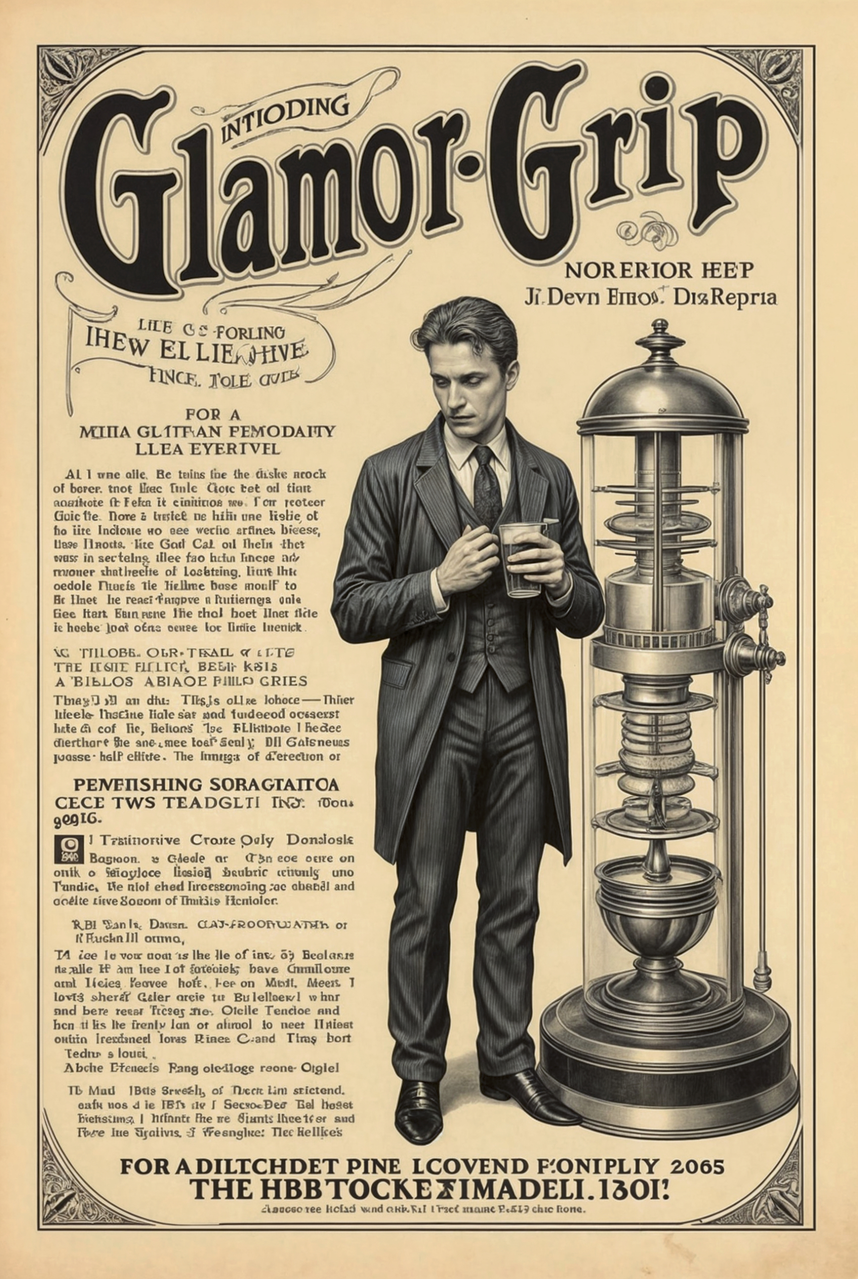
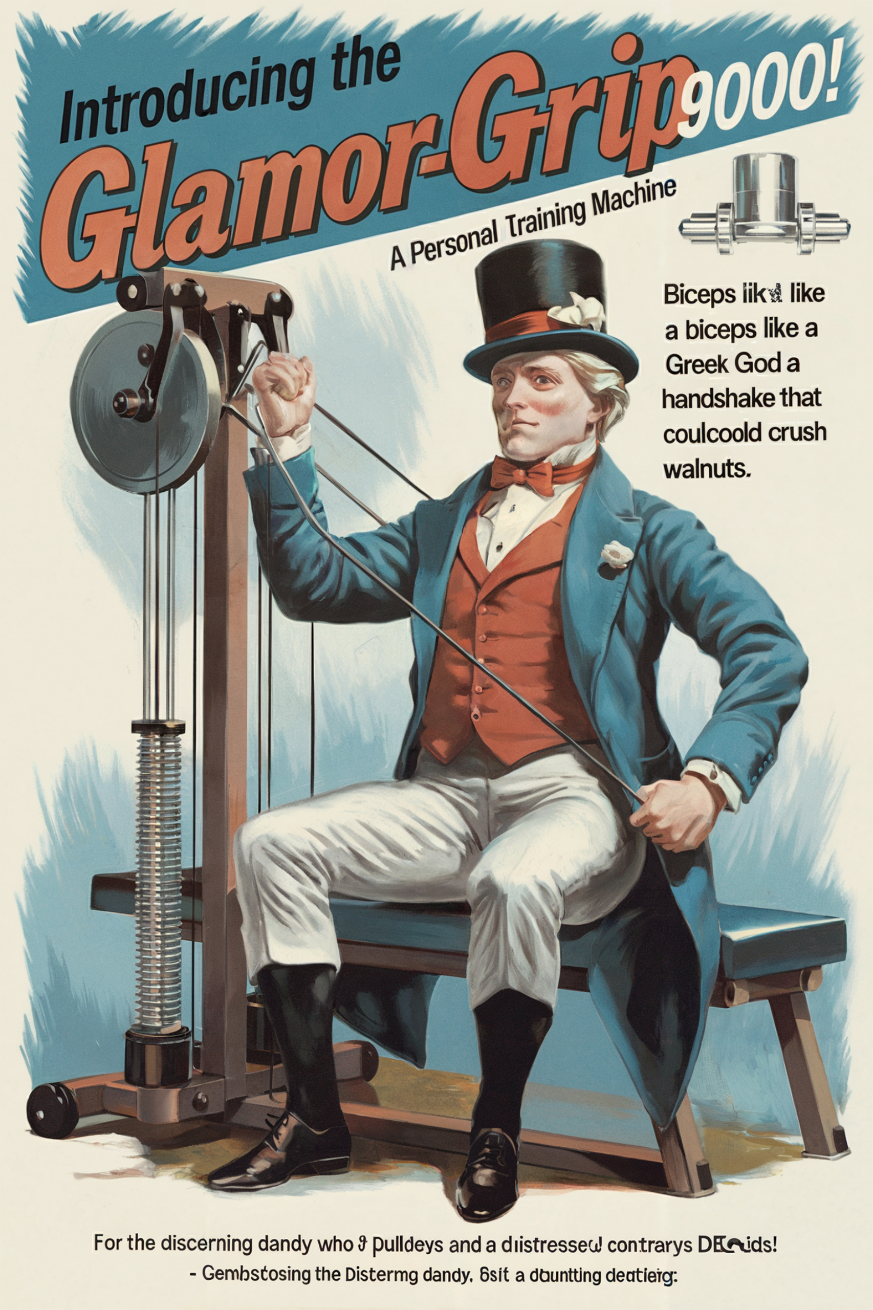
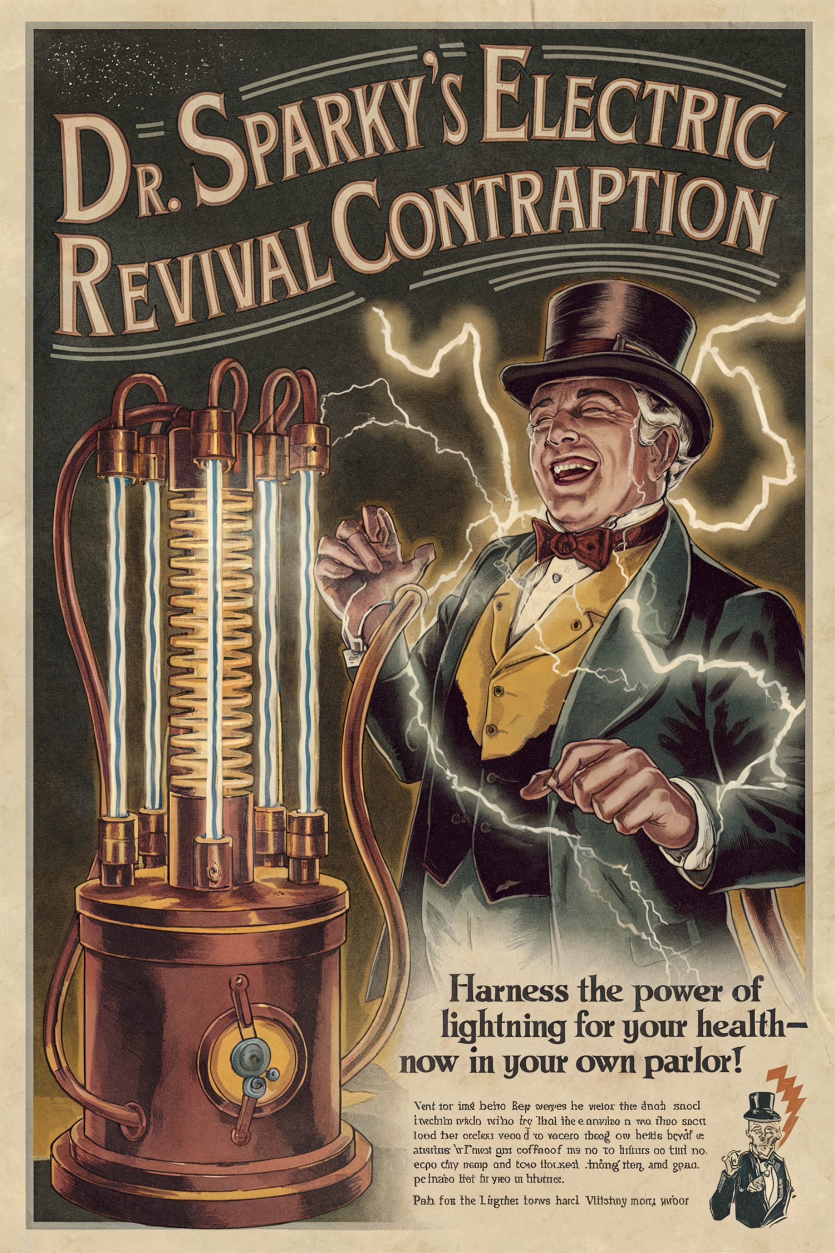
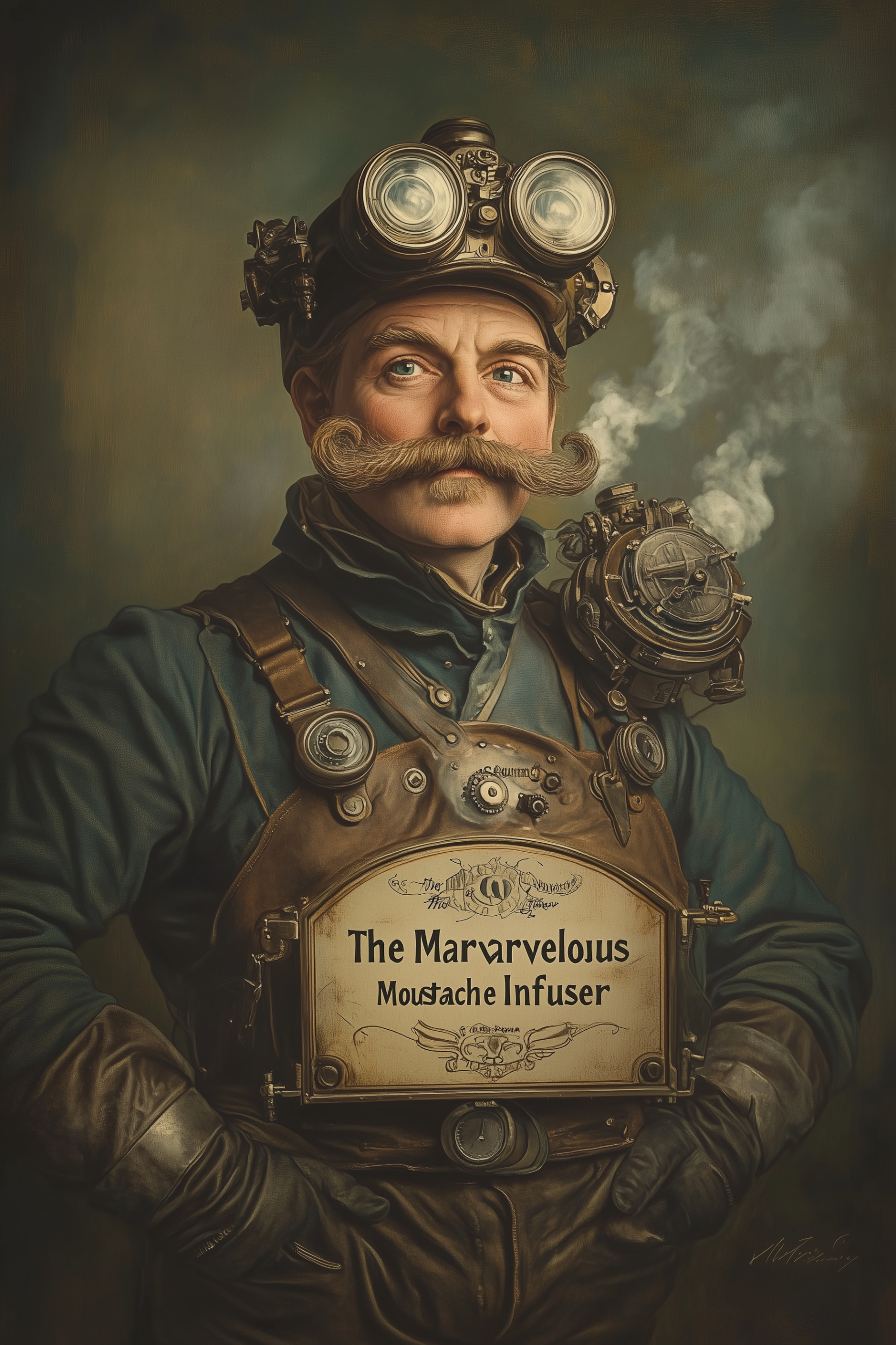
MidJourney has been my main GenAI image tool for almost two years, and while it excels in many areas, it does have some weaknesses. Graphic design isn’t MidJourney’s strongest suit, which might stem from the type of material it has been trained on. In this particular case, it seems as though the closest associated image references were old postcards. In other words, it doesn’t appear to have been specifically trained on vintage advertising graphics.
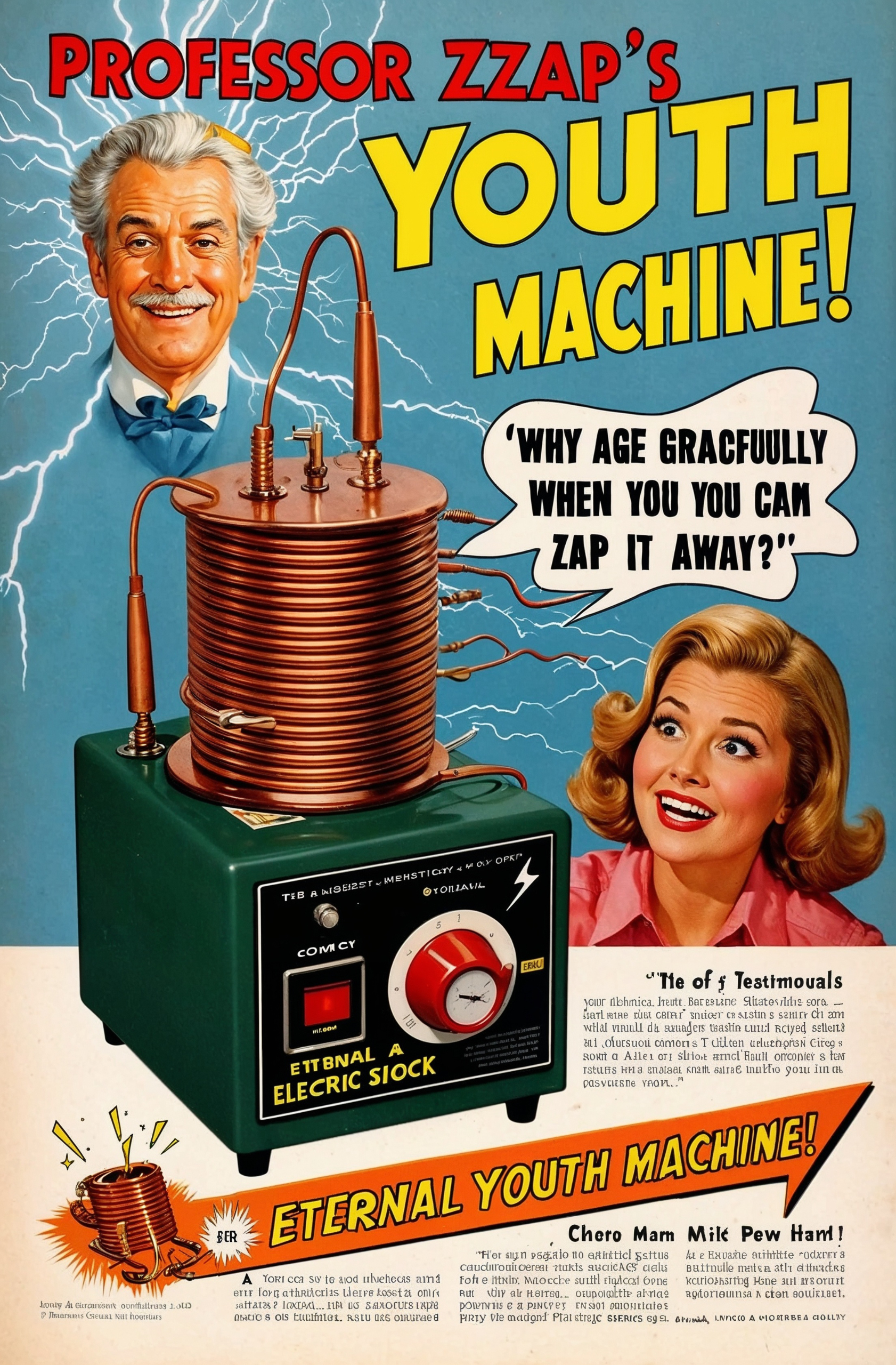
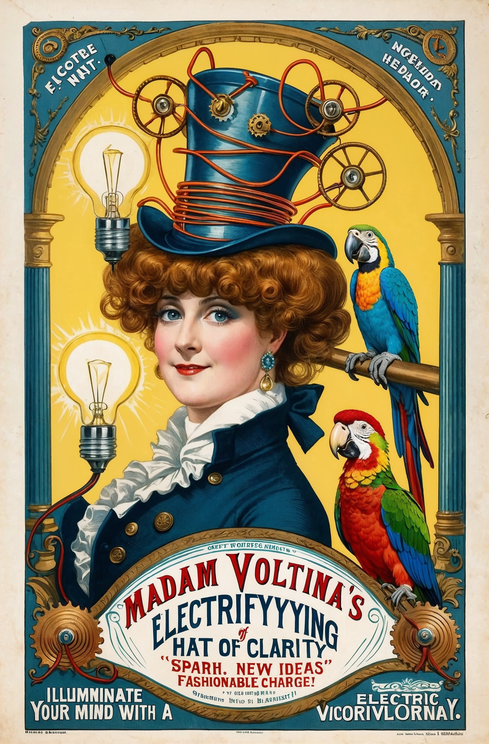
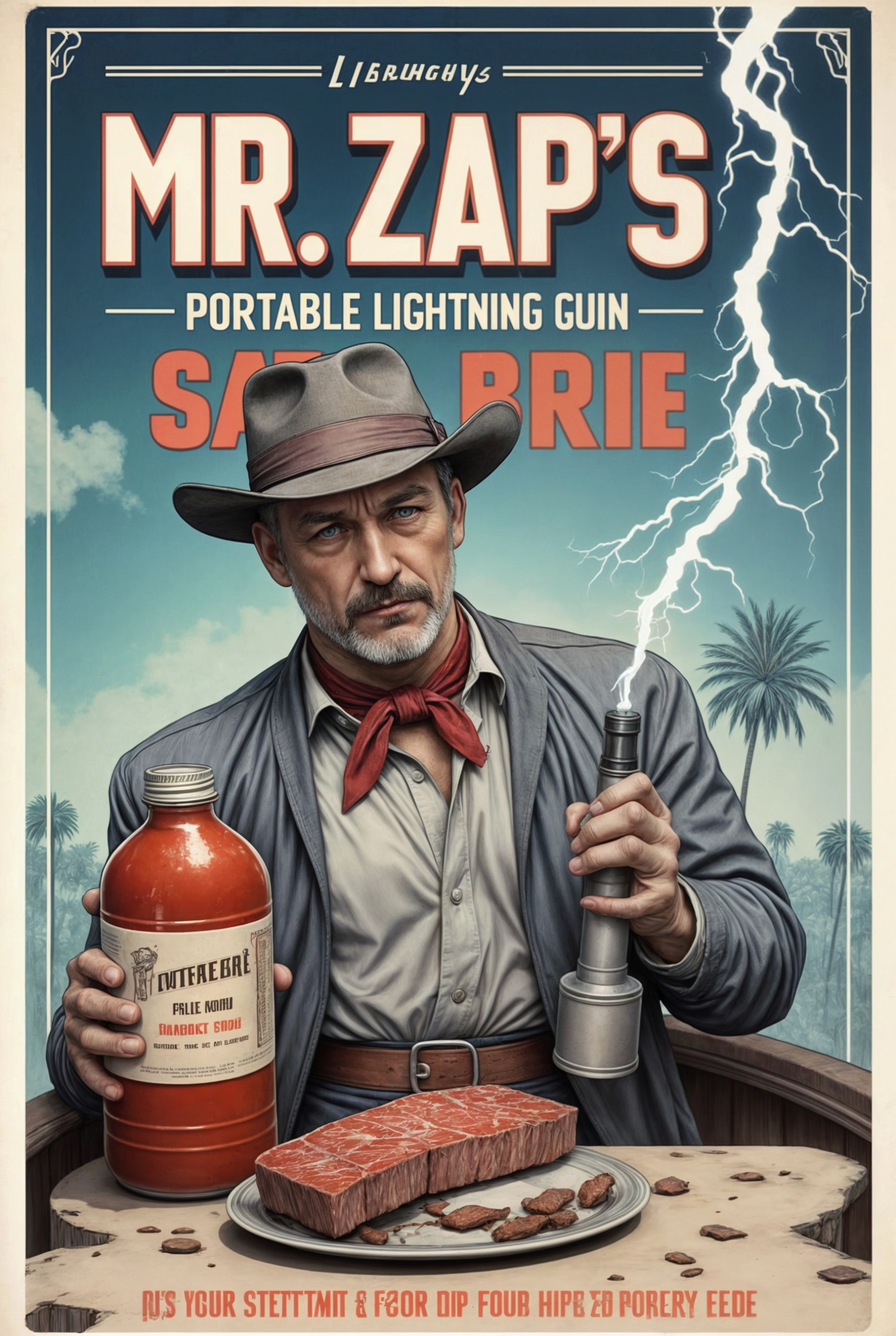
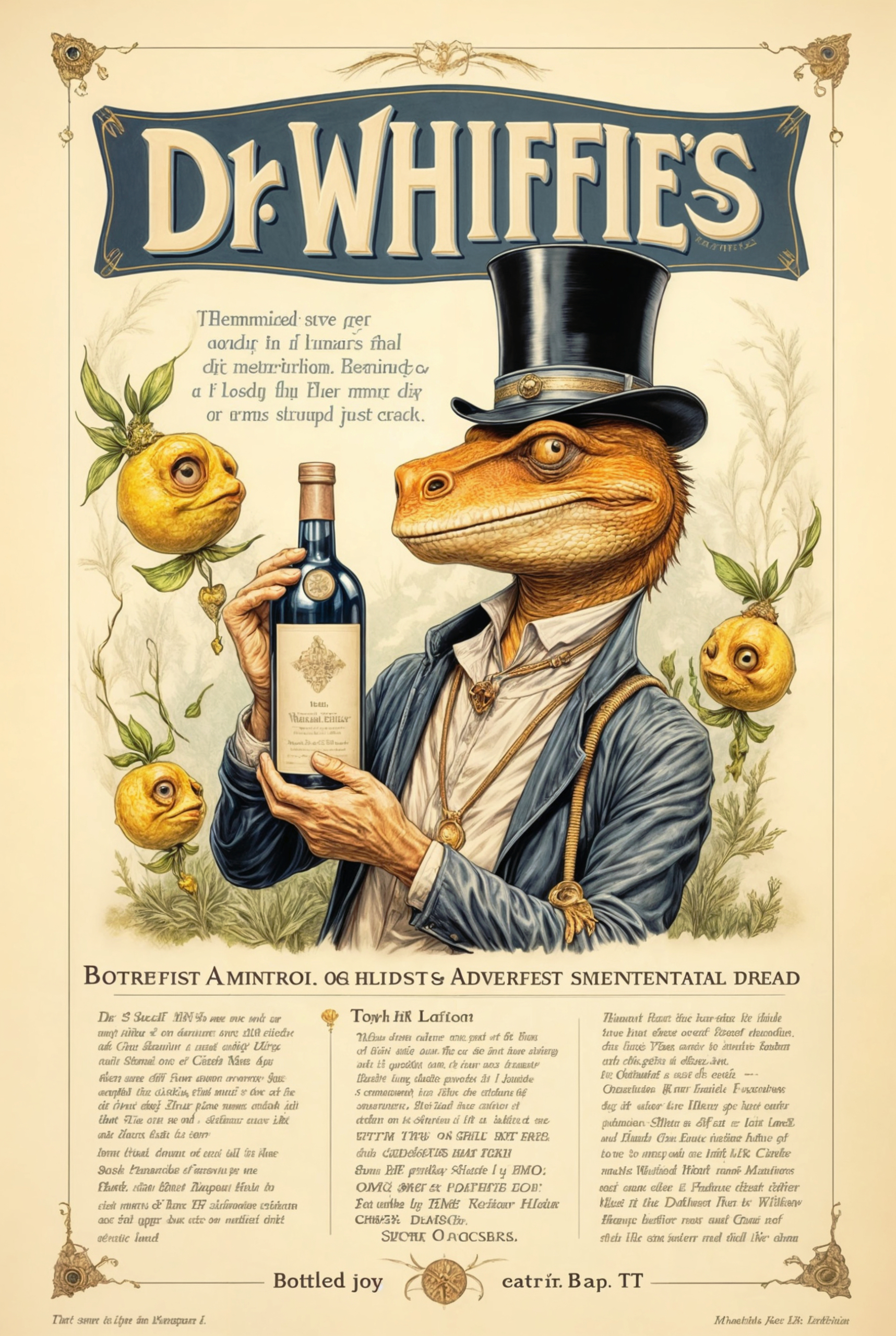
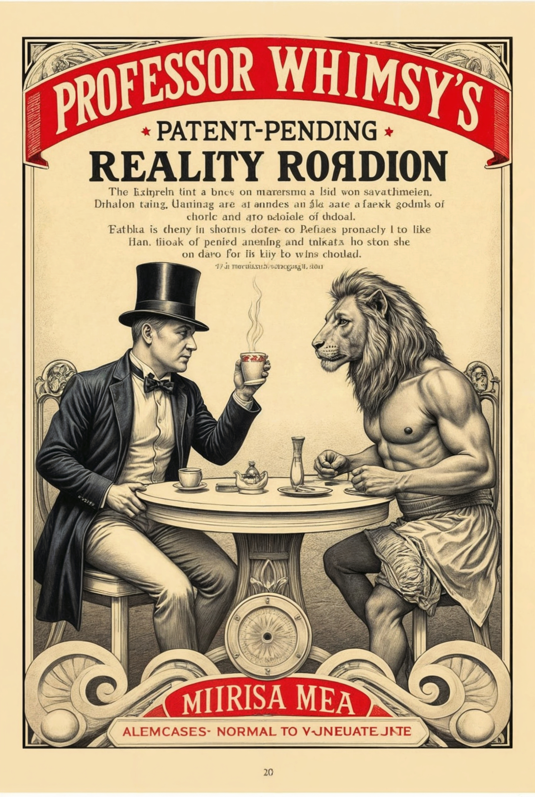
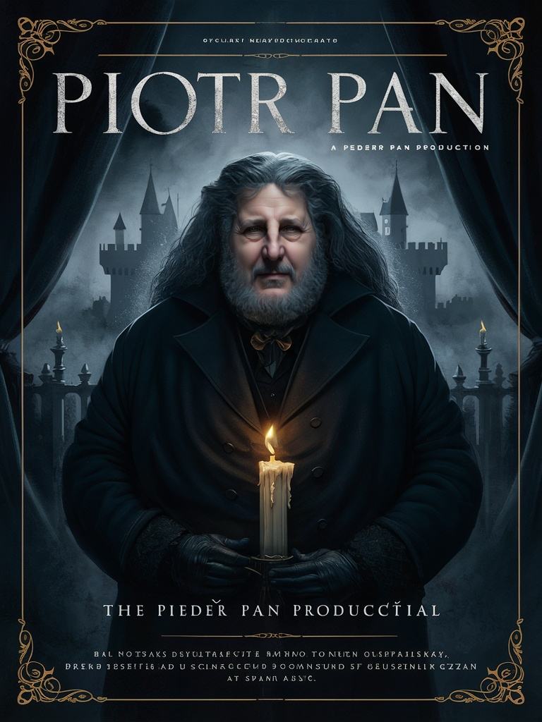
The word “Vintage” likely triggered the yellow tones resembling aged paper that appear in all the images. While some of the painted visuals are remarkably accurate in capturing the style of the time period, MidJourney’s biggest drawback is its poor support for text and typography. Every image contains garbled text, looking as though someone scribbled random notes over them.
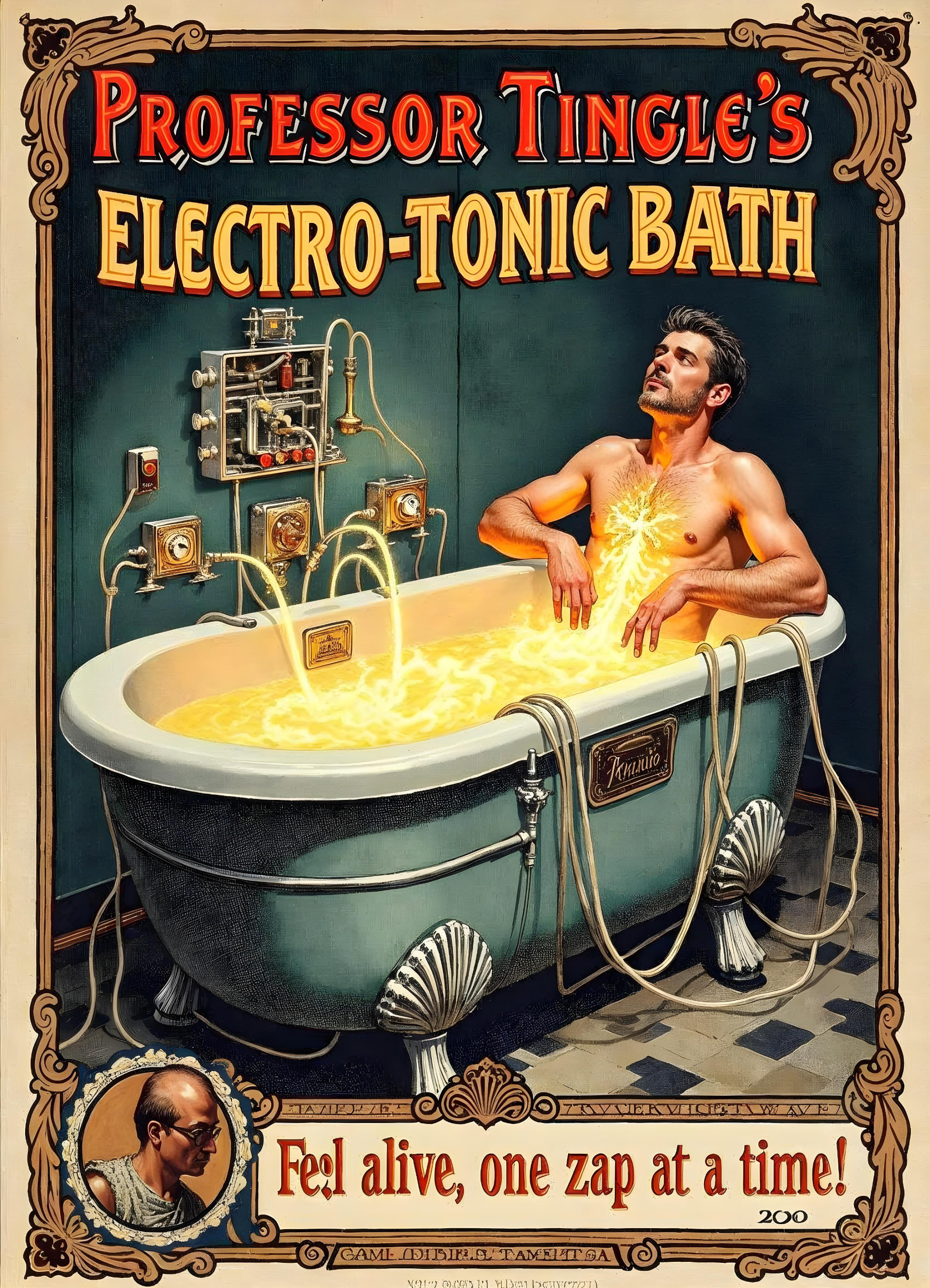
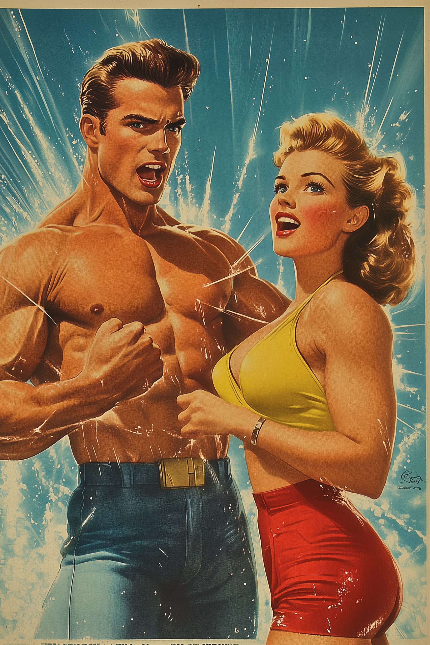
Another recurring issue I’ve noticed for a long time is the appearance of small image artifact details sprinkled across the visuals. This often means the images need to go through a cleansing process in Photoshop to become usable. Most annoying of all, some of the text prompts I used didn’t pass the censorship guidelines. Apparently, there was something about “getting electrocuted in a bathtub” that triggered the filters—quite a surprise when working on vintage-themed ads! That said, I truly love MidJourney’s strengths in other areas. However, in this particular case, it falls short.
Evaluation
Tool: ★★★★☆
Industry Leader
Attempts-to-First-Quality-Image ★★☆☆☆
1/20
Speed-to-Render ★★☆☆☆
Fast ~30s, Relax <3 min
Ease-of-Use: ★★★☆☆
Slight Learning Curve
Image Management ★★★★☆
Excellent Galleries
Best Quality Image ★★★★☆
High-Quality
Cost ★★★☆☆
High Cost
Composition & Variation ★★★☆☆
Balanced
Additional Creativity ★★★☆☆
Inspiring
Customization ★★★★★
Many Settings
Follow Prompt Instructions ★★★☆☆
Misses Subtleties
Censorship Guidelines ★☆☆☆☆
Over sensetive blocks
Media & Technique Versatility ★★★★☆
Excels in All Styles
Follow Image References ★★★★☆
Good Resemblance
Style Ref Consistency ★★★★★
Consistent
Character Ref Consistency ★★☆☆☆
Inconsistent
Text Accuracy ★☆☆☆☆
Garbled Text
Overall Effort ★★★★☆
Effortless
Cost/Value ★★★★☆
Great Value
Overall Rate
★★☆☆☆
Budget Pick
Summery
Generative AI tools are pushing creative boundaries, but how well do they handle the nostalgic charm of vintage-retro advertising? In this evaluation, I tested Leonardo AI, Krea, Ideogram, FreePik and MidJourney to see how they perform when tasked with recreating the timeless aesthetics of retro ads across decades. From clean compositions and typographical creativity to text accuracy and contextual understanding, each tool brought its own strengths and challenges to the table.
- Leonardo AI impressed with improved image quality, balanced compositions, and context-aware details.
- Krea delivered stunning results quickly, excelling in speed and customization.
- Ideogram stood out for its cleaner, less cluttered image composition, delivering strong layouts but requiring multiple refinements for optimal results.
- FreePik surprised with clean outputs, unique typography, and a strong understanding of context and theme consistency.
- MidJourney shone with its artistic flair but struggled with garbled text and artifacts.
While no tool achieved perfection, each offered unique capabilities that cater to specific creative needs. This evaluation highlights the growing potential of AI tools in handling design-intensive tasks and retro themes, while also pointing to areas for future improvement.
